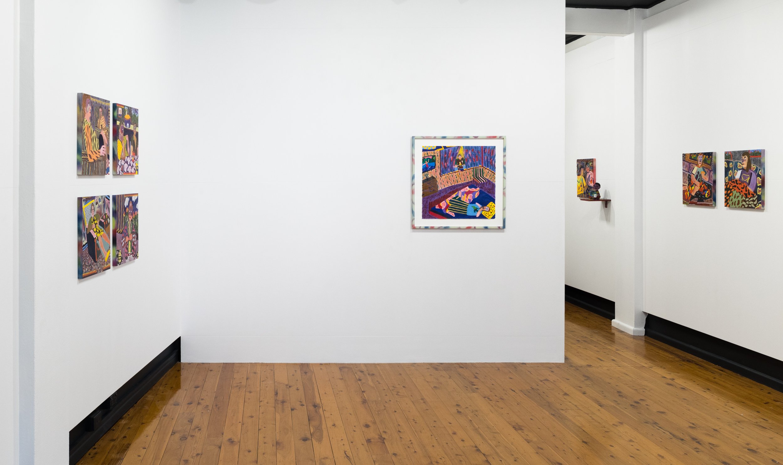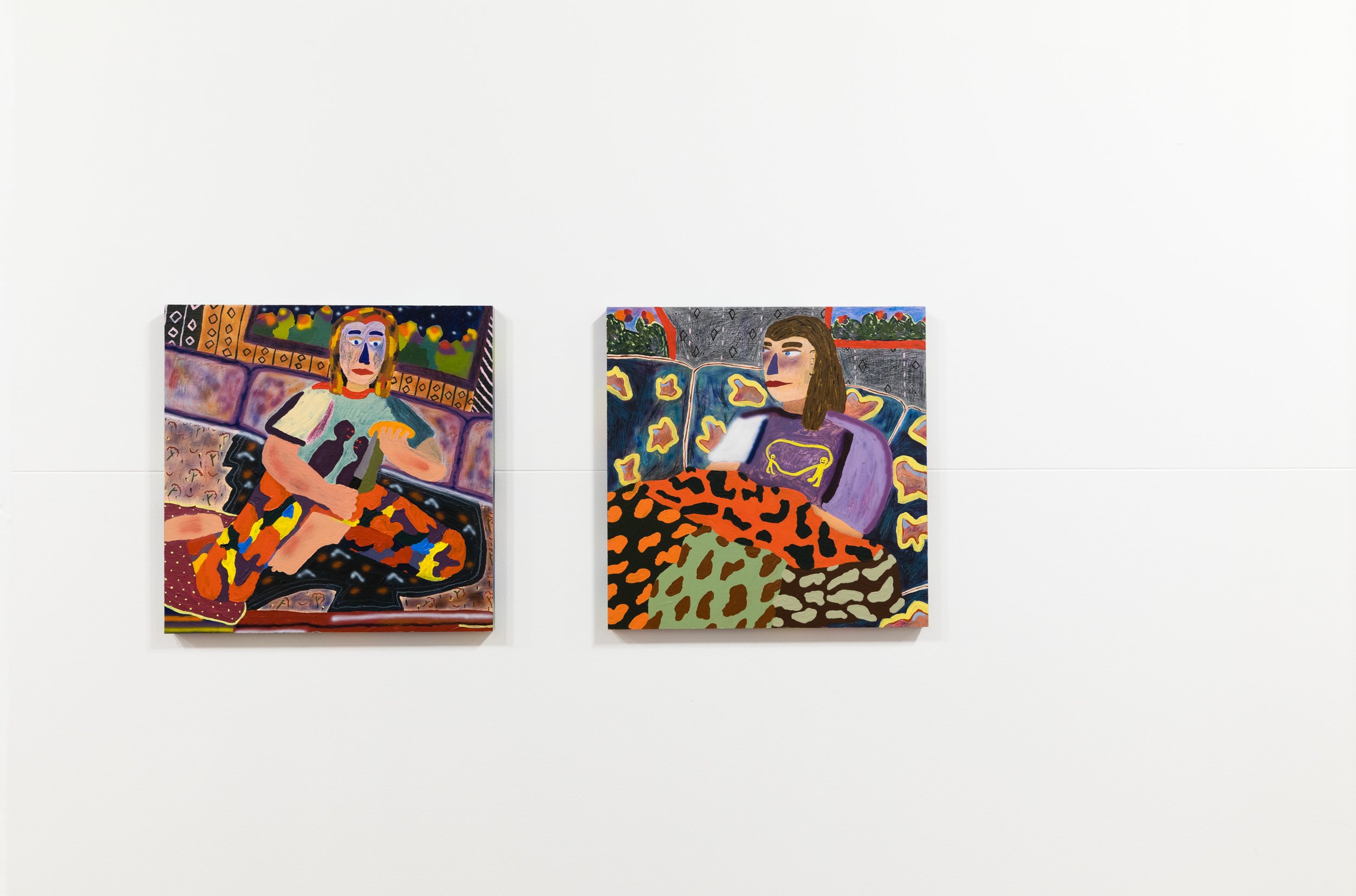
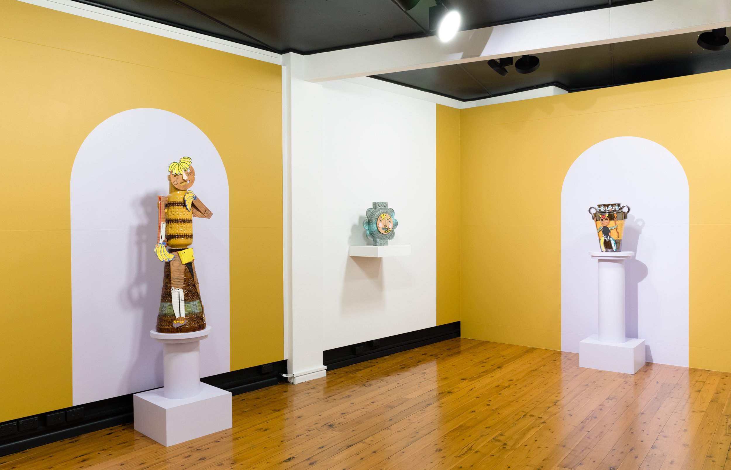
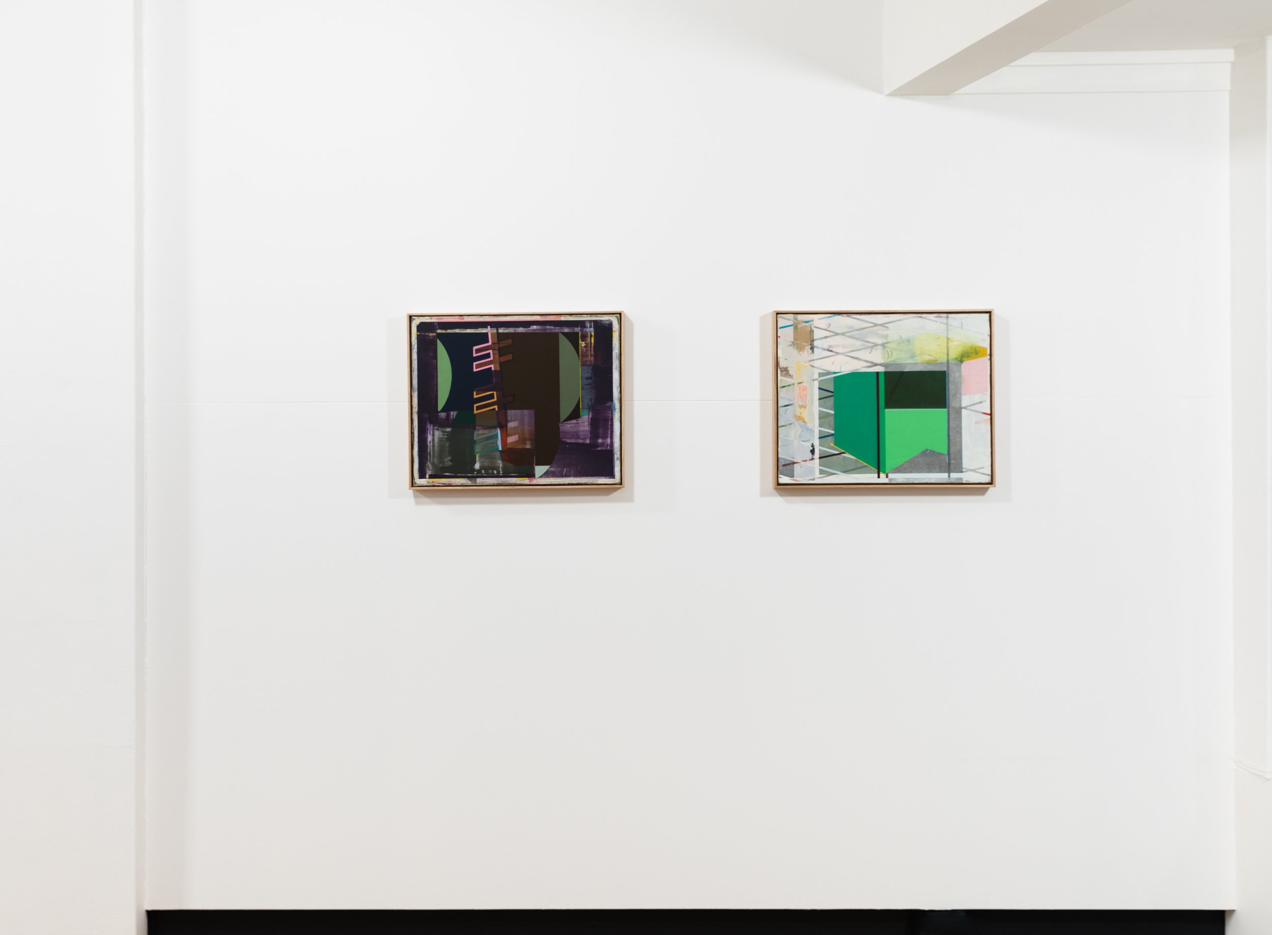
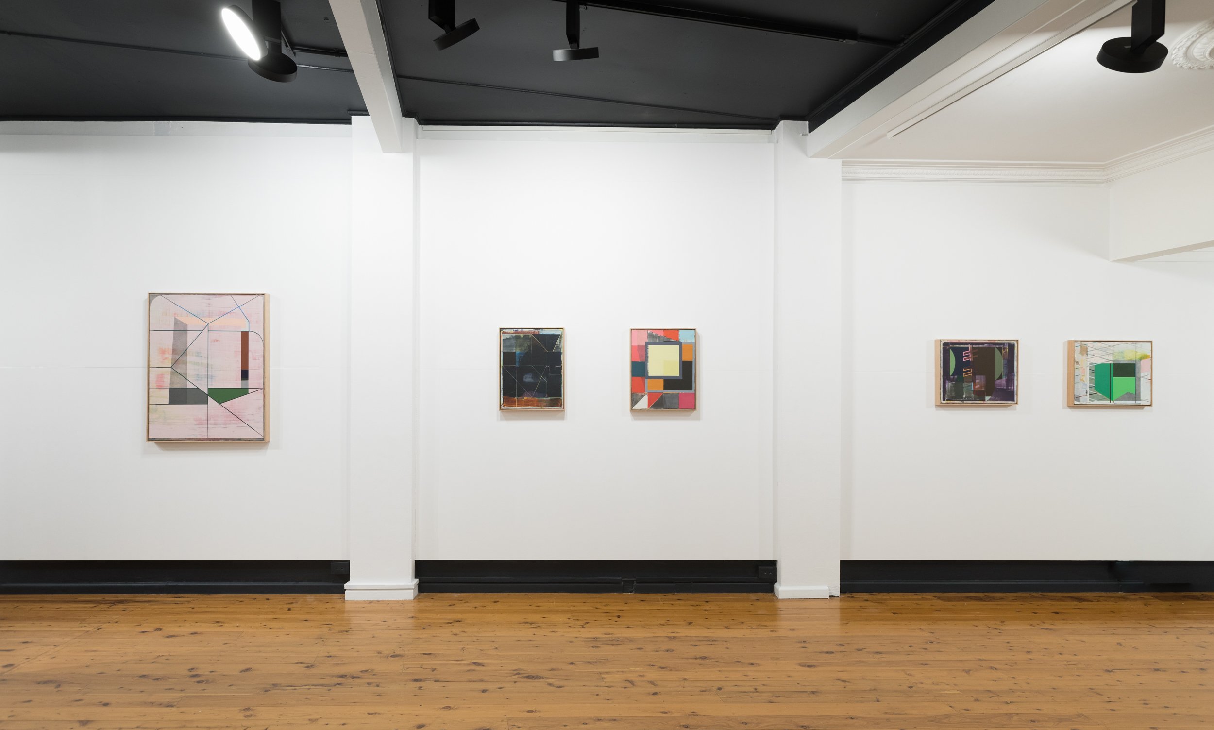
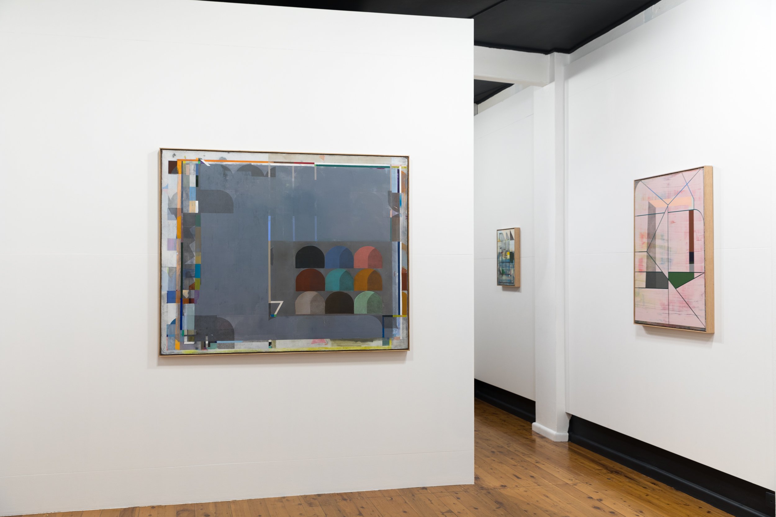
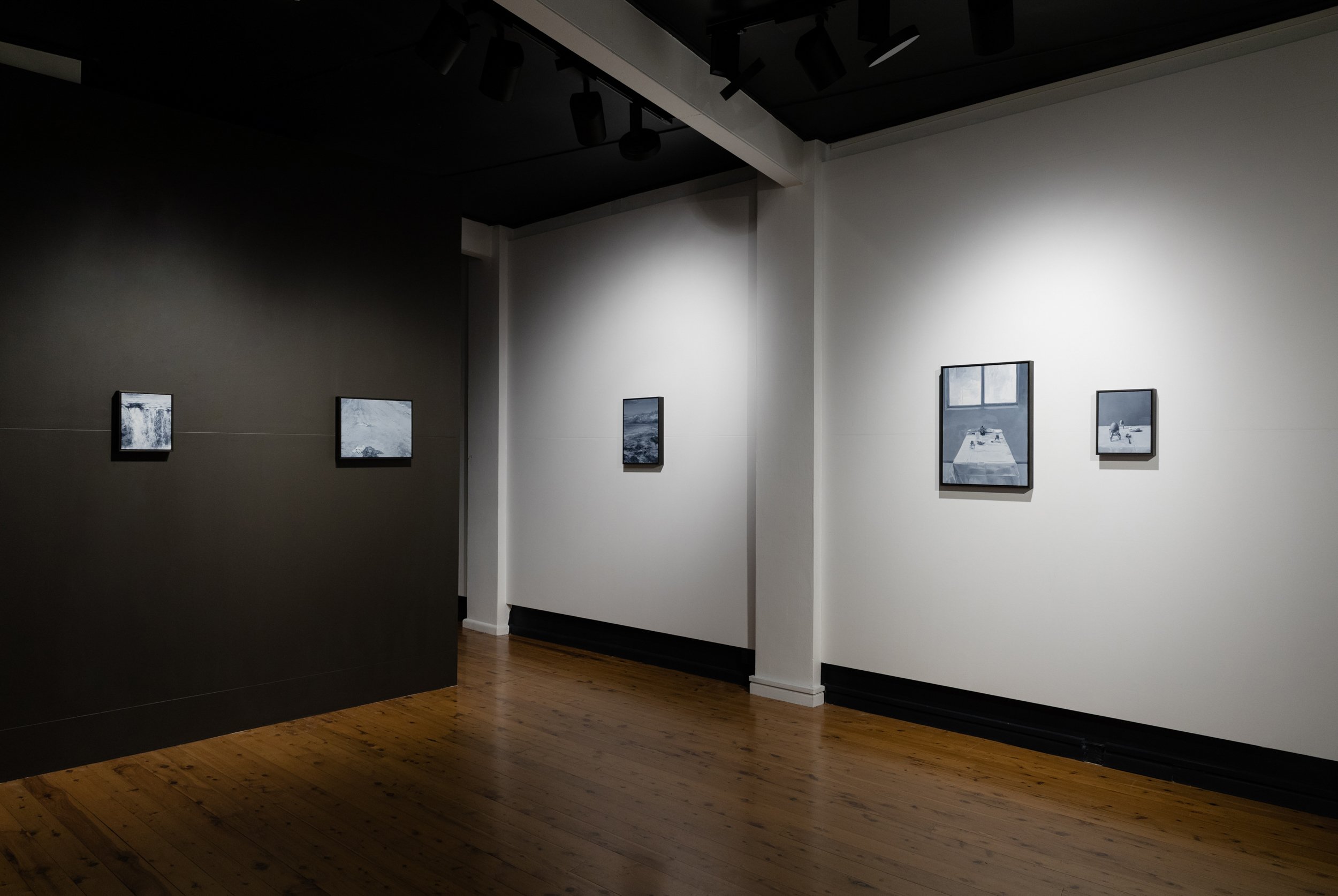
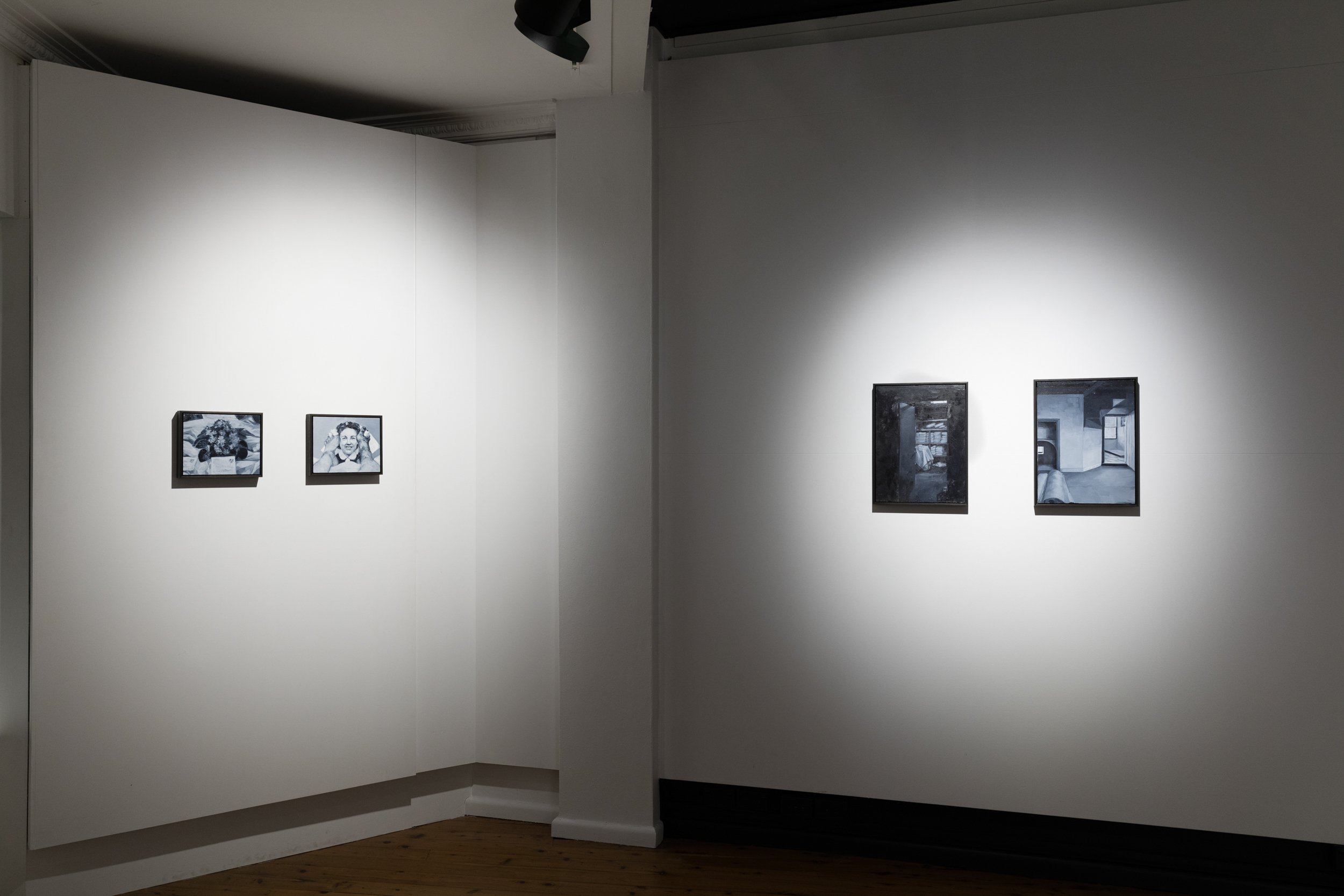
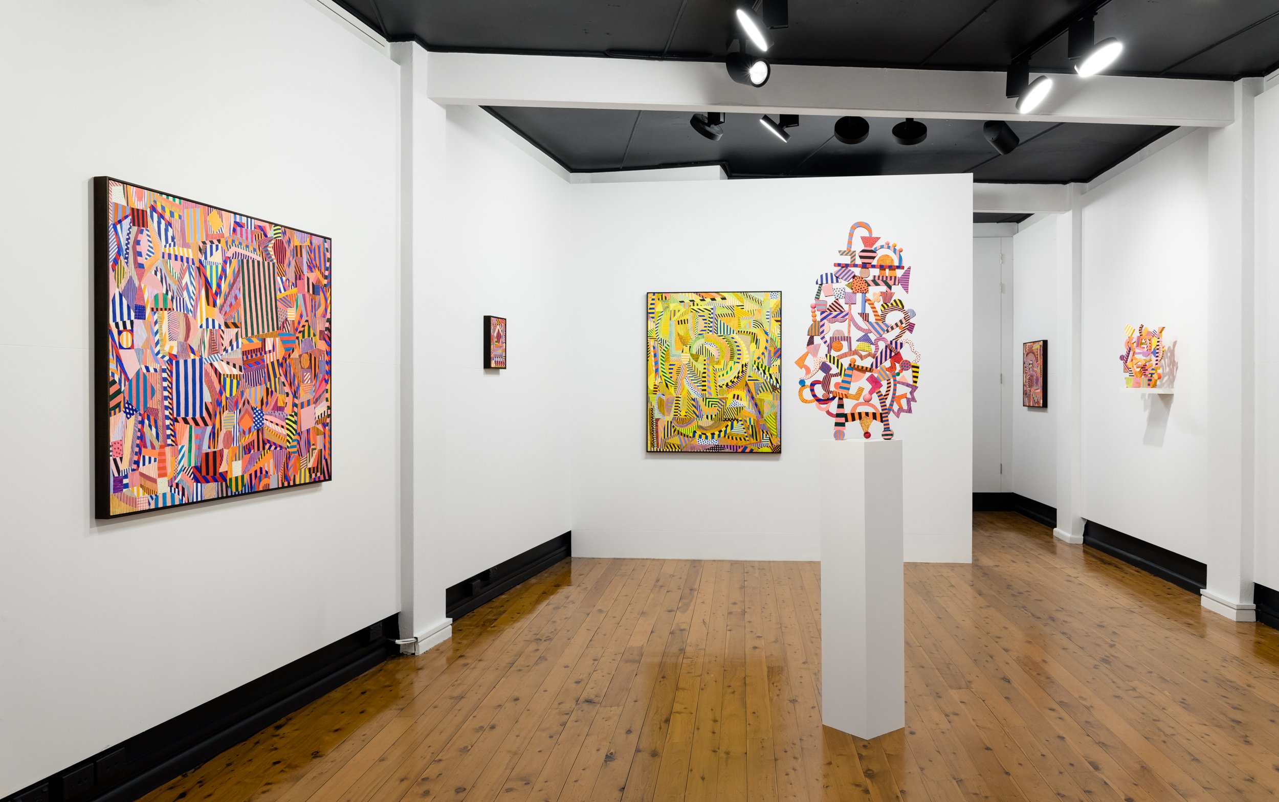
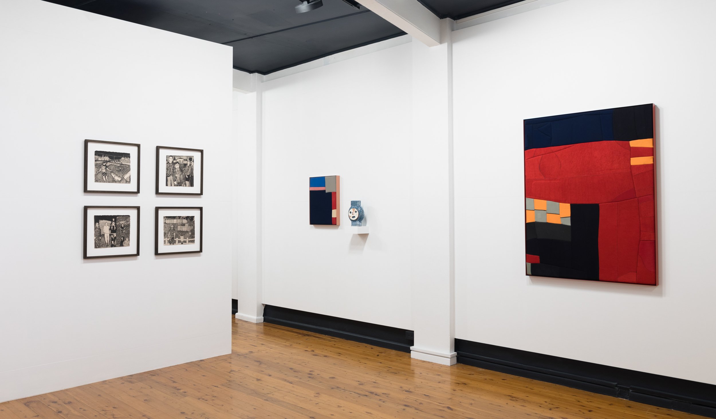
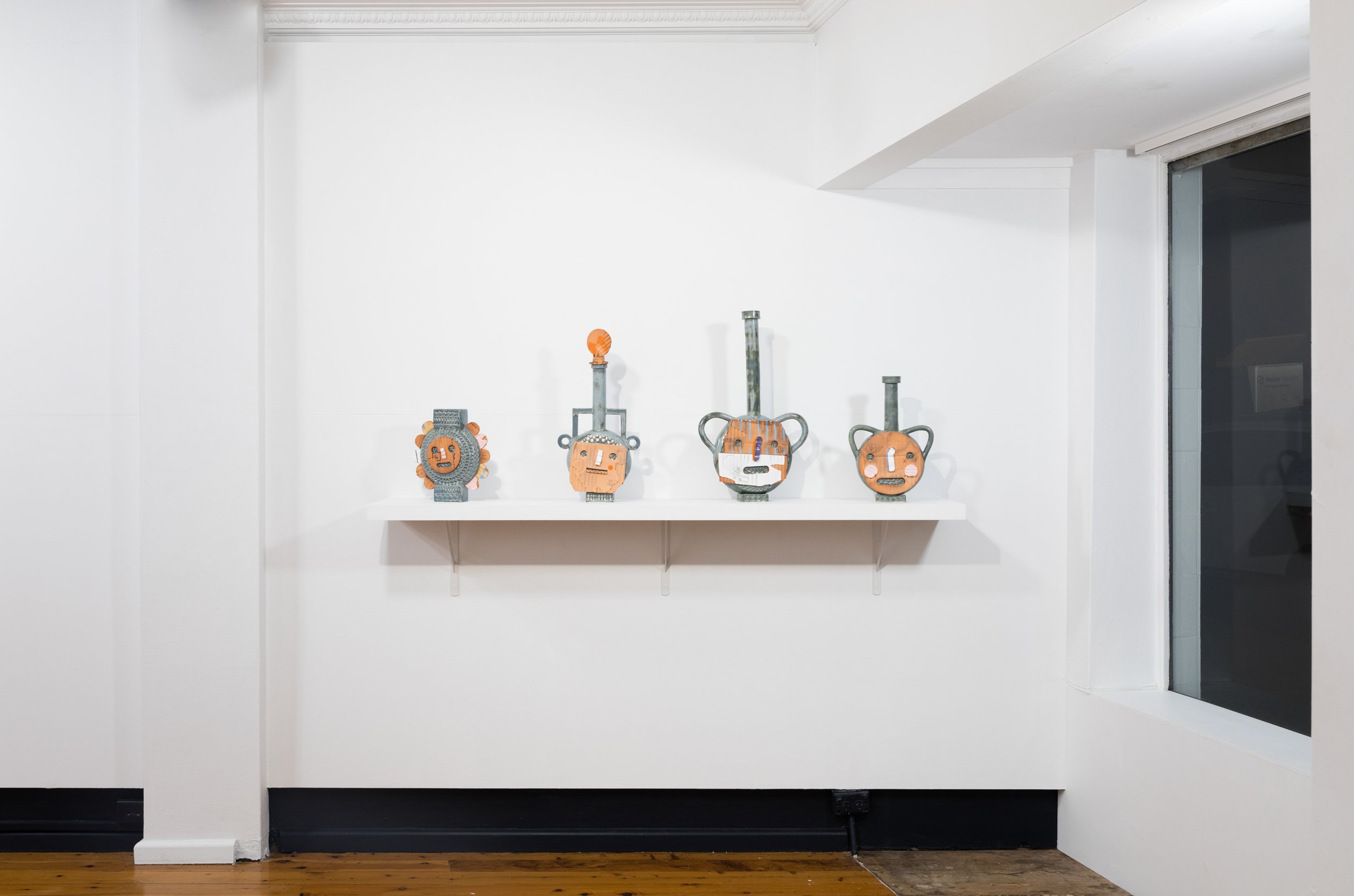
AND THEN THERE’S THIS

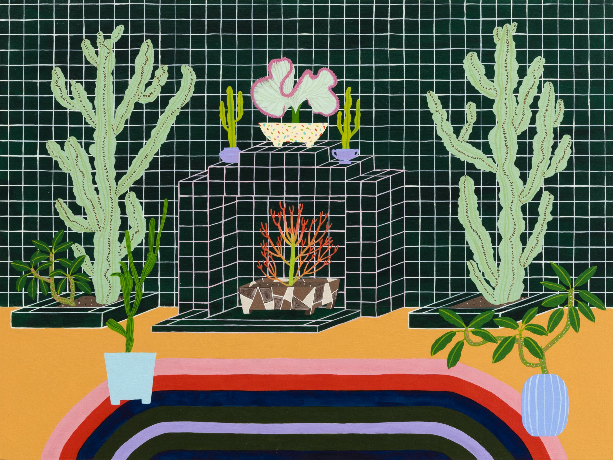
Will Hilzinger, Silver Lining, 2024, Acrylic, paper, aluminum cans, and glue on Masonite, 122.5 x 91.5 cm
AND THEN THERE’S THIS
JOIN US ON FRIDAY 8 MARCH, 6 - 8 PM, FOR THE OPENING OF AND THEN THERE’S THIS
FEATURING: Isriel Adams, Rosie Deacon, Will Hilzinger, Jackson McLaren and William O’Toole.
8/3/2024 - 30/3/2024
Egg & Dart has relocated to Shop 2, 175 Keira St, Wollongong, NSW 2500
E info@egganddart.com.au
P +61 402 932 647
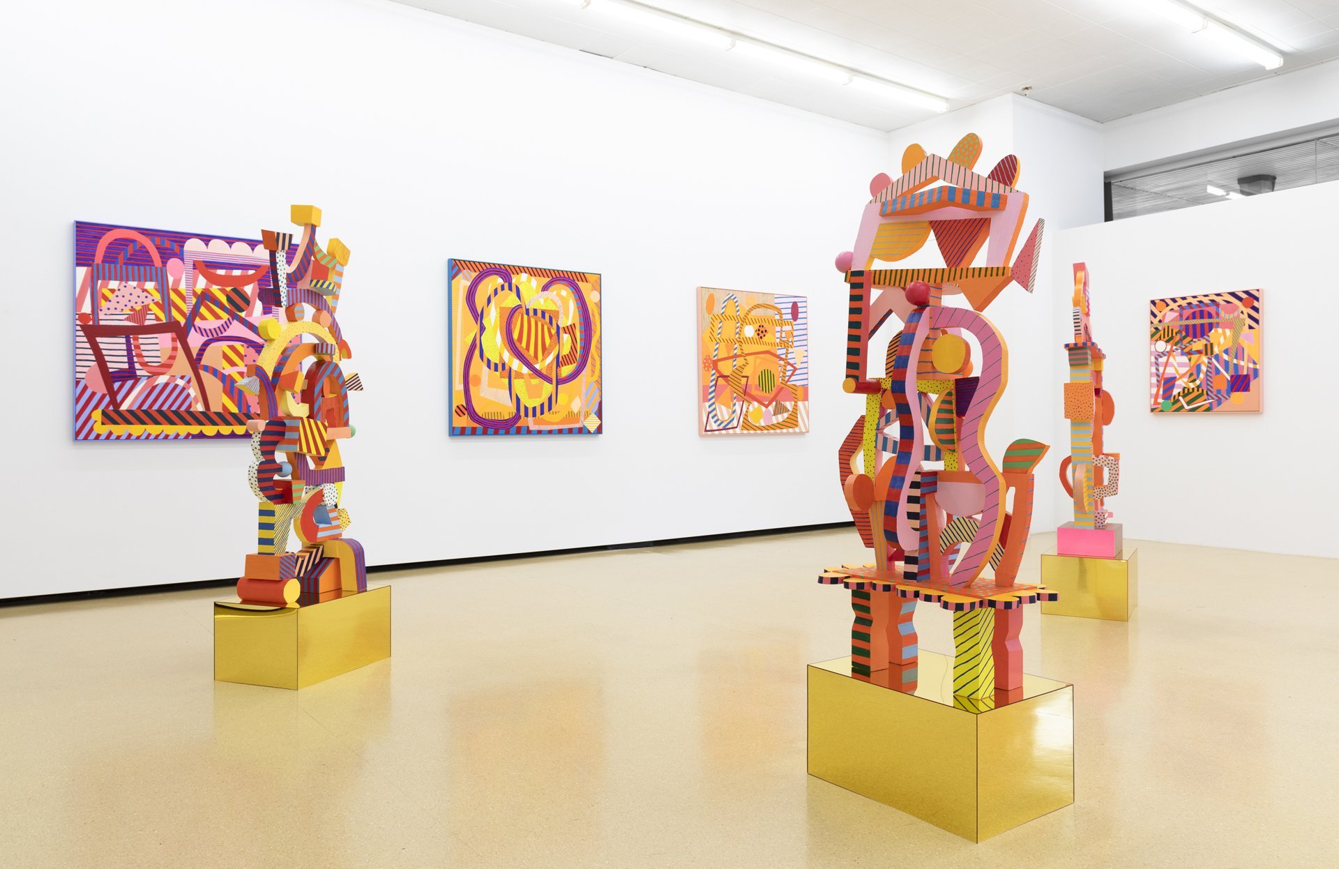
SYDNEY CONTEMPORARY 2023
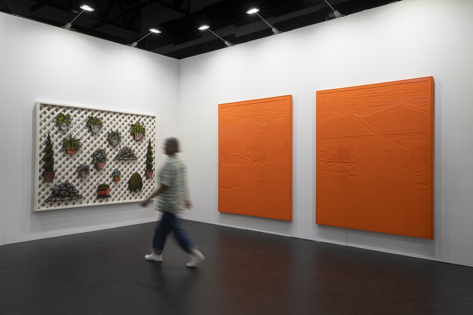
Christopher Zanko, Sydney Contemporary 2023, Installation View
SYDNEY CONTEMPORARY 2023
At Sydney Contemporary 2023, Chris Zanko presents new pieces on aluminium and his largest hand carved wood-relief works to date in both monochrome and colour. With both new material and scale, Wandering Where elevates the artist’s continuing appraisal and appreciation for Australia’s mid-century housing. An installation of cut-out forms attached to lattice furthers the dialogue between the plan-based format of the house and the vernacular and at times eccentric front yards attached to them.
Funding from the Create NSW Visual Arts Commissioning Program has allowed the Wollongong based artist to research innovative materials and work with new processes. He states: “My subject matter, the context of these mid-century dwellings, is so tied in with industry and manufacturing from the steelworks, the smelting, the foundries. I really wanted to do something with steel or aluminium. It was hard to land on something that was going to have the same amount of detail I create in a relief work.”
Zanko initially talked with foundries before collaborating with a metal finishes company to get the striking result showing at Sydney Contemporary. He began by carving a representation of the blast furnace at Port Kembla Steelworks and then had the work 3D scanned. It was then printed with aluminium in different finishes. The outcome is a solidly sculptural yet pictorial form in a pressed metal edition of three. The manufacturing process is an invigorating synthesis of material and context and an exciting progression. As he reflects, “The blast furnace is a place where workers are manufacturing multiples but on a mass scale. I wanted to play a bit further with that idea of the multiple. And of course, the steelworks is the centre of production, tied to the ongoing work that I have made looking at housing in Wollongong.”
Expanding on this are the large monochrome wall works commenced in 2022. These sustain the detail of the artist’s full-colour pieces but pare it back to one confidently selected hue. They offer an assured textural surface where we can explore variations of pattern and legibility in the image. The monochrome Flashe vinyl orange floods across the wood carving in a colour that suggests contemporary life, signage, high viz and car finishes. Zanko describes the colour as like the glow of the steelworks at night or the vivid silhouette of a red brick house burnt to the retina on a bright summer day.
Cohabiting with the aluminium and monochrome works are wood cut-outs installed on lattice that explore an incidental array of topiary, plant pots and garden objects. Zanko has an ongoing interest in the way the front yard offers a setting for individual design expression. The installation suggests open-ended rearrangements, like ad hoc extensions made to homes and the interaction between formal and informal design expression.
Prior to the lattice installation, the artist had worked with found and stacked breezeblocks, wallpaper and garden fountains in gallery spaces. The larger wall pieces and ongoing installation are all part of Zanko’s pursuit to make even more immersive work. A bigger scale allows him to embed a lot more information in the scene, whether it be the tiles, folds in curtains, driveways or the addition of decorative borders that invite the viewer to step across into this parallel space. The cut-outs inversely bring elements out into the gallery space in the looser way we might need to employ navigating sculptures or plant pots along a garden path.
The aluminium edition, monochromes and cut pieces are significant expansions in Chris Zanko’s loving appreciation of mid-century Australian homes. It has been a wildly prodigious development since the artist’s first solo exhibition at the Egg & Dart, Wollongong in 2017. A recent solo show in the heart of Tokyo in 2022 (Laidbug, Shibuya-ka) brought the artist closer to his enduring interest in Japanese woodblock print methods. Recent media has given further vivid context to his practice, including a great documentary piece for the ABC Art Works program. There have also been articles in Art Collector Magazine. Significantly, in 2022 he was a finalist in the Sulman Prize (AGNSW) and in the Hazelhurst Works on Paper Prize. In 2021 there was a major commission for the Rose Seidler House 70 th Anniversary. That work resides in the Museums of History NSW Collection, with Chris Zanko’s work also found in the collections of the Wollongong Art Gallery and University of Wollongong.
Words - Melody Willis
This project is supported by the NSW Government through Create NSW.
7/09/2023 - 10/09/2023
Egg & Dart has relocated to Shop 2, 175 Keira St, Wollongong, NSW 2500
E info@egganddart.com.au
P +61 402 932 647
Spring 1883 Art Fair

Egg & Dart
Spring 1883 Art Fair
Suite 220, The Hotel Windsor, Melbourne from 9 –12. August, 2023.
Presenting Gabrielle Adamik, Scott Duncan, Aaron Fell-Fracasso, Erin Mison, Darren Munce, Henry Jock Walker and Christopher Zanko.
SCOTT DUNCAN | SUMMERTIME BLUES

Scott Duncan, Summertime Blues, 2023, Raku Clay, Underglaze, Glazes, Acrylic, 77 x 50 x 48 cm. Image by Silversalt Photography
SCOTT DUNCAN | SUMMERTIME BLUES
JOIN US ON FRIDAY 28 JULY, 6 - 8PM, FOR THE OPENING OF SUMMERTIME BLUES BY SCOTT DUNCAN
We are looking at a new major work in Scott Duncan’s studio. It has the appearance of a mid-century vessel emerging from what feels like chipped away concrete aggregate. This chunk is surfaced with what appears to be small tiles from the weathered frontage of an old corner store. As the artist says, “I want it to look like an excavation of a milk bar from the 70s.” But while the piece suggests an amalgam of materials, these are wholly ceramic objects with material and conceptual integrity. Darker glazed patches of ceramic mimic the aggregate and the small tiles are formed by a pattern pressed into the clay from the base of a bread crate.
As he assesses the qualities of the newly fired object, Scott Duncan states, ”I’m not a tromp-l’oeil artist.” His core objective is to transfer idea to form, later summarising that, “I made this because I wanted to see what it looked like.” Consistent with this, Scott Duncan talks about figuring out how to make things as he is making them. The ideas are generated in clay with very little drawing. In the place of drawing is an experimental approach to tools. “Bits of stuff from the kitchen, dome moulds, bevelled edges. I used wedges of balsa to imprint those patterns,” pointing to the clay circular decoration on one of his iconic bird vessels (which another visitor described as feeling like embossed leather bags). These adaptive tools allow him to explorequalities which are not usually found in clay. “I want to explore added texture – texture that does not belong in traditional pottery.”
Another development is the artist’s use of text fragments to spark memories or unearth histories. The wall works “Hot Dog” and “Chewie” loop around through word definitions, graphic design memories and contrasting textures. Circling this is wit and nostalgia for forms that fold in through generations. Like the feeling of chewing gum in your mouth, then spat out and deposited on a surface, Scott Duncan’s work is a textural, sensory realm hardened into ceramic form.
Summertime Blues is Scott Duncan’s second solo show at The Egg & Dart. With an ArtBank commission and work in private collections, this exciting presentation of new work follows on from an active period of group exhibitions including a showing at Sydney Contemporary in 2022. Scott Duncan will also be presenting work at the Spring1883 Art Fair, Melbourne in August 2023.
28/07/2023 - 19/08/2023
Egg & Dart has relocated to Shop 2, 175 Keira St, Wollongong, NSW 2500
E info@egganddart.com.au
P +61 402 932 647
GROUP SHOW | INSIDE
Ebony Eden, Euphorbia Boogie, 2023. Acrylic on board 40.5 x 30.5 cm.
GROUP SHOW | INSIDE
JOIN US ON FRIDAY 23 JUNE, 6 - 8PM, FOR THE OPENING OF INSIDE FEATURING SEAN CROWLEY, AMY CUNEO, EBONY EDEN, ROB HOWE AND MARK MERRIKIN
23/06/2023 - 15/07/2023
Egg & Dart has relocated to Shop 2, 175 Keira St, Wollongong, NSW 2500
E info@egganddart.com.au
P +61 402 932 647
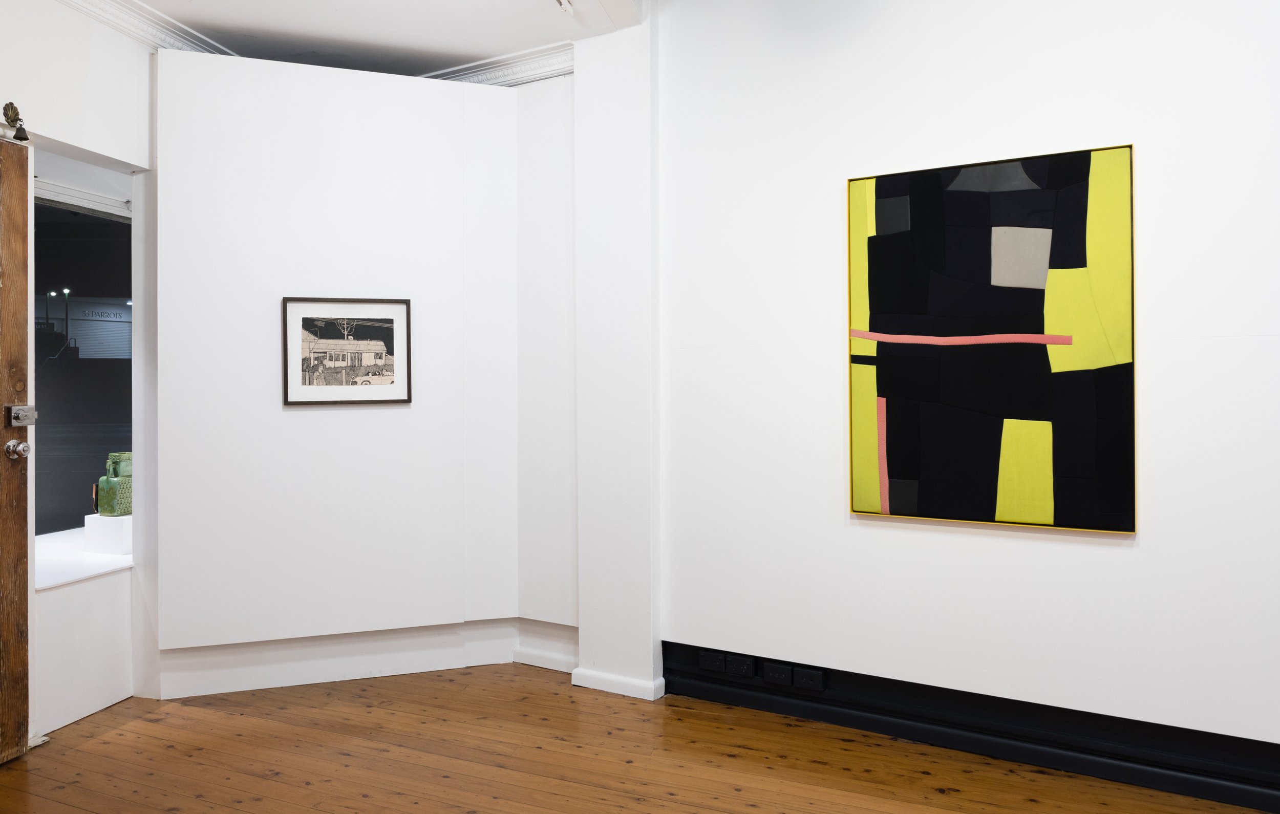
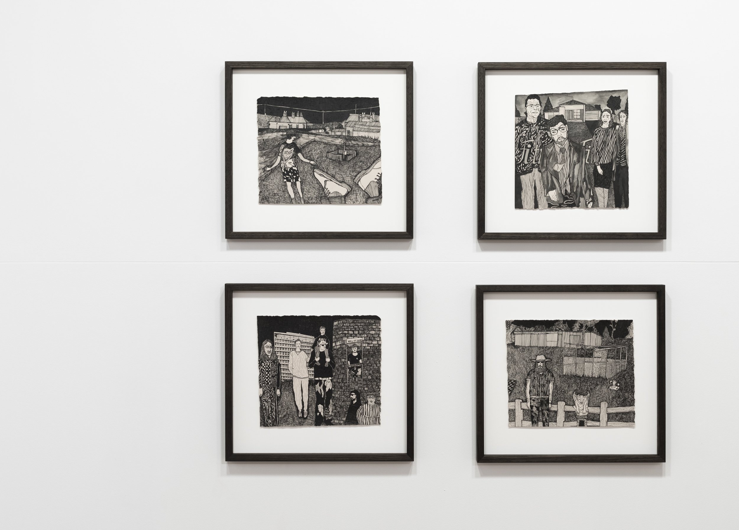
CHRISTOPHER ZANKO | DOWNSHIFTER

Christopher Zanko, DS1 (Bellambi Red Brick And Awnings) 2023. Acrylic on hand carved wood, 145 x 122 cm.
CHRISTOPHER ZANKO | DOWNSHIFTER
JOIN US ON FRIDAY 21 APRIL, 6 - 8PM, FOR THE OPENING OF DOWNSHIFTER BY CHRISTOPHER ZANKO.
Based on an unwritten cultural narrative, Christopher Zanko’s latest exhibition Downshifter captures both the similitude and distinctive character of suburban landscapes, particularly within the Greater Illawarra. Referencing both larger cultural histories of the region and everyday Australian experiences, Downshifter presents spatially nuanced explorations of post-war suburban vernacular, with reference to more recent patterns of urban migration. The show includes 15 works and maintains Zanko’s signature emphasis on the stylistic elements of mid-century Australian domesticity, this time with an elevated sense of sentimental permanency.
Inverting familiar tropes of the suburban landscape as peripheral and derivative, Zanko skilfully comments on the naivety of viewing cities as bastions for creativity and individuality. Suburban landscapes are witnessing a cultural renaissance; recent patterns of migration have triggered a literal ‘downshift’ of people from cities to regional areas, and pandemic-related lockdowns also inspired downshifts in both lifestyle and routine. Zanko’s acute awareness of how this suburban sprawl and subsequent gentrification affects the cultural heritage of the Illawarra has created an urgency for its preservation. Tensions surrounding what constitutes as heritage and what deserves protection mean that many of the subjects featured in Zanko’s artworks will be preserved only through his woodblock carvings.
There exists an inherent irony in Zanko’s oeuvre – his process is technically demanding, laborious and requires precision, but the subjects featured in his artworks are often produced in abundance. This polarity helps Zanko elevate the status of his subjects; although there exists opportunity to create infinite copies of each artwork, Zanko makes the conscious decision to keep his output to a minimum, highlighting each piece’s individuality.
Downshifter is underpinned by a deeper personal narrative; Zanko expresses a fondness for simpler times in his adolescence, articulated through both subject matter and composition. There is a softness to the works, aesthetic and conceptual, that implies a sense of tender longing. Shadows play an important compositional role; the image, obscured, invites viewers in for interpretation. The artworks are not intended to be portraits of specific sites, but rather layered representations of cultural history.
Zanko describes his recent solo exhibition in Tokyo as a formative experience in his career which empowered his identity as an artist and solidified his process. A mysterious sense of ritual is found throughout Downshifter, influenced by both personal and philosophical connections to Japan. There is a pleasure in the process; carvings are rhythmic and precise, triggering a downshift in both the artist and his audience to a meditative state.
- Molly Lasker
21/04/2023 - 13/05/2023
Egg & Dart has relocated to Shop 2, 175 Keira St, Wollongong, NSW 2500
E info@egganddart.com.au
P +61 402 932 647

JULIA FLANAGAN | PARADISE CIRCUS

Like the looping lines that circuit her work, Julia Flanagan’s paintings and sculptures are intricately linked. Drawings may begin as plans for sculptures but then emerge as painting. Zoomed in sections of an earlier work establish a starting point for the new, before the introduction of dynamic ribbons in scintillating patterns.
The latest paintings play more intensely with all these layers. Formats based on the geometry of the quilting square (used by her mother) are a stable background. But with this anchor in place, curlicues then twist in front and around, at times weaving in and out like a needle in motion, a thread bouncing off or negotiating edges. These movements encourage us to then move similarly around the sculptures which Flanagan is now really turning up to the scale of the body. Elevated on specifically designed plinths, they address the standing figure but also speak of the hand, of construction in wood as well as in painting and drawing. The cut-out assemblages breathe into the space with their attuned negative shapes. They feel like aspects of the paintings that have been brought out into another dimension for reflection and clarity.
The Paradise Circus series started with sketches made last year while Julia Flanagan was immersed in home schooling. As she states, “That’s where these more open, layered paintings came from. I’ve done a stack of really little drawings. A painting might come from a sketch that would be half an A4, maybe smaller. They start off quite miniature mainly because I can do that quickly.”
To find shape, Flanagan looks to aspects of the everyday. To get started on drawing she might sit and look around her home studio and find forms from architecture and design that then shift through her generative drawing. One painting references a favourite chair. We might not locate the form of a chair in the final piece, but it offers a sensibility to establish a new compositional thing. Titles for work are similarly open, with references to music that connect tangentially and arise as the artist works.
In Paradise Circus there is delight and dynamism. Flanagan’s work is an extended exploration of visual pleasure but it is a tricky field that she constructs. Forces of wild linear patterns locate a joyous in-between tension, and then circle us back into the space of the body through sculptures that transcribe ovals to spheres and lines into rods and prisms.
In November 2022, Julia Flanagan is a finalist in the Fishers Ghost Prize. She won the Georges River Sculpture Prize in 2019 and has shown at Sydney Contemporary in 2020. Also in 2020, Flanagan collaborated with the Gorman (Textile and Fashion Design) brand. This is her third solo exhibition with The Egg & Dart.
Words by Melody Willis

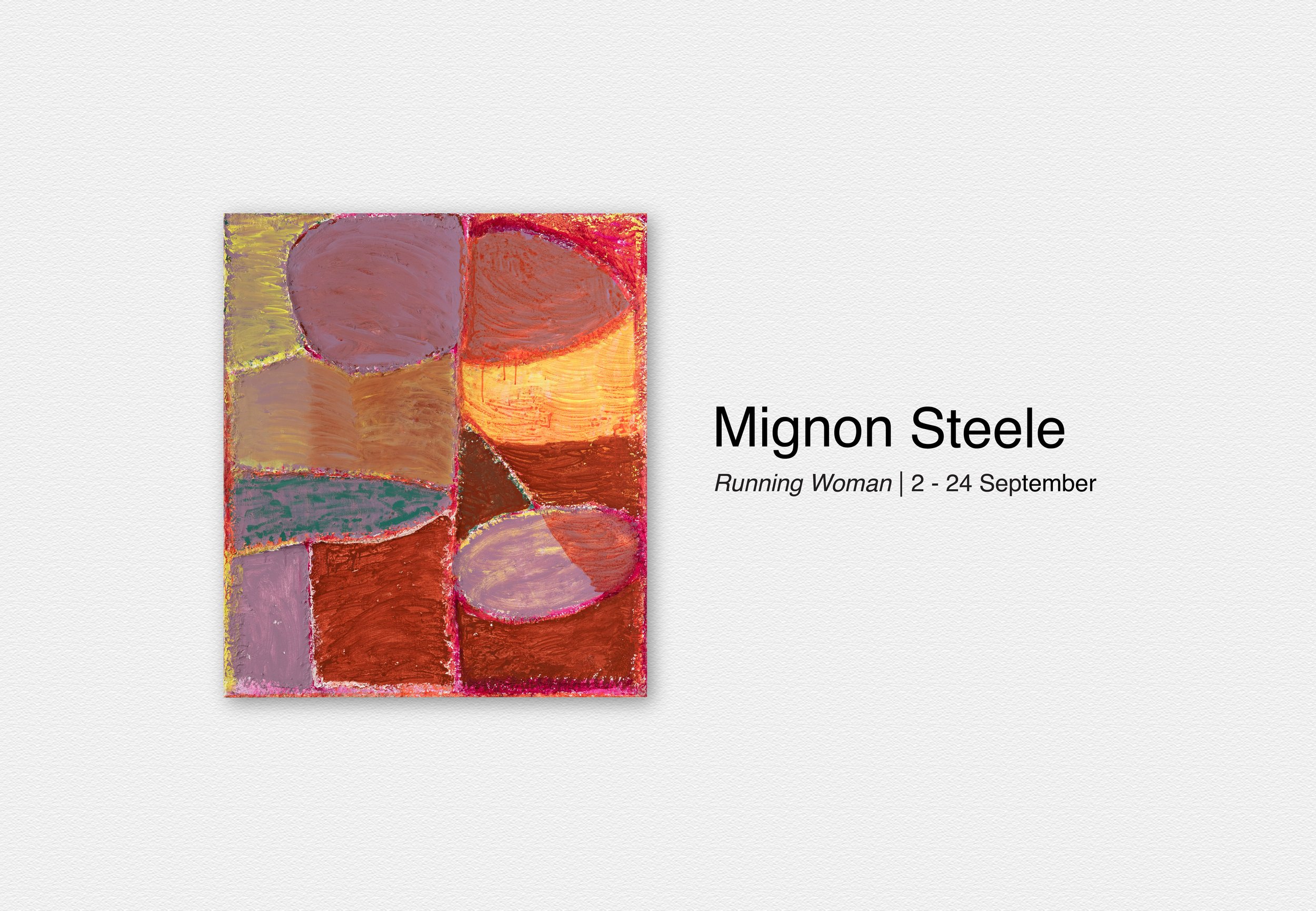
MIGNON STEELE | RUNNING WOMAN
Mignon Steele describes the shapes that emerge in her work as familiar enough to have names – banana peel, bottle, mushroom. As ways of working, these forms have hung around from earlier painting days but are boiling up again, remixed at new scales. She loops around them, shifting their depth and discernment, using them as a grounding force for new work. The shapes range – from protozoan creatures to the other end of the scale – suggesting repetitions from tiny imprints to the galactic. It’s not so much a language as it is a codex of marks and habits and ways of working that are revisited, carved out or newly summoned.
The organisation of the smaller works is described by the artist as “like little terrains, aerial worlds, models, landscapes”. Being more a feeling for landform than a mapping, Mignon Steele has built up areas with recycled yellow pages bound with wood glue. She refers to these accretions of surface as “hedges or stone walls” that push toward the sides. At times they form a sculptural frame. In other instances they are like a collection of fields, some tended, others lying fallow. It’s a kind of feeling out through painting to the edges of things, building up in parts, then pushing back down, the work eroding so that the surface is weathered to something geological. As viewers, we might fall off the edge only to discover that the sides of the paintings are also addressed, with a suggestion that the work just keeps on going, expanding and breathing through layers of colour. Opaque tints of yellow refuse to disappear under rich sepia reds shifting to magenta. Wild colour laps up against the edges of these papier maché fields, washing back to expose submerged hues beneath.
Running Woman refers to a ponytailed jogger that Mignon Steele notices when travelling between studio and home: “I see her as a kind of talisman, a spectral figure. I haven’t resolved what it means to see her yet, but I know it means something.” An inspiration, a tender touchstone, a consistency but also a metaphor, they might appear to the artist along a path, at the supermarket, or on a trail. Running woman is an emerging form in the artist’s way of working, landing somewhere between the micro-organisms and the celestial pinpoints that populate the work.
In the paintings on linen, Steele invites us to “get inside them a little more”. These larger works relate more to the scale of the body and, with a few cues (like a discernible ground plane or horizon), we can gather pictorial readings. They are initiated rapidly and have what the artist describes as a “stage-like quality” where she visits habitual forms like the blue-red mushroom or a book, banana peels and diatoms (plankton).
One large work on linen, Sitting Woman, uses that same earthy red as Running Woman but here it is pushed back by various tints of blue-green. Works like these have a direct connection to the drawing practice the artist continues in the evening and then brings to the studio. These paintings are “an extension of a language of shapes and voids and sensibilities that starts in a sketchbook and is elaborated on with paint and time.”
The eponymous Running Woman painting reminds Mignon Steele of the Marcel Duchamp glass piece, “The Bride Stripped Bare”, specifically in the way the forms stand quite upright or collage-like. In Steele’s work, the shapes are organised as an earthy mid-ground in front of blue. She joked in its casual process of making that it was “the banana stripped bare” (there’s that banana peel again). But as the work resolved itself, this informal title fell away. Humour is used as levity in a perplexing world where disaster and dilemma are prodded by human impacts. Steele describes a combination of feelings and thoughts around “nature, earth, perils and then funny stuff that cracks me up a bit”. It’s there in the titles – something lighter used as a brace but also an invitation to look further and let the works build their heavy scope in your own time as a viewer. An example, “Legless lizard”, is a gentle start that allows the work to emerge as complex over time, embedded with painterly problems, hopeful glimpses and partial resolutions.
Melody Willis


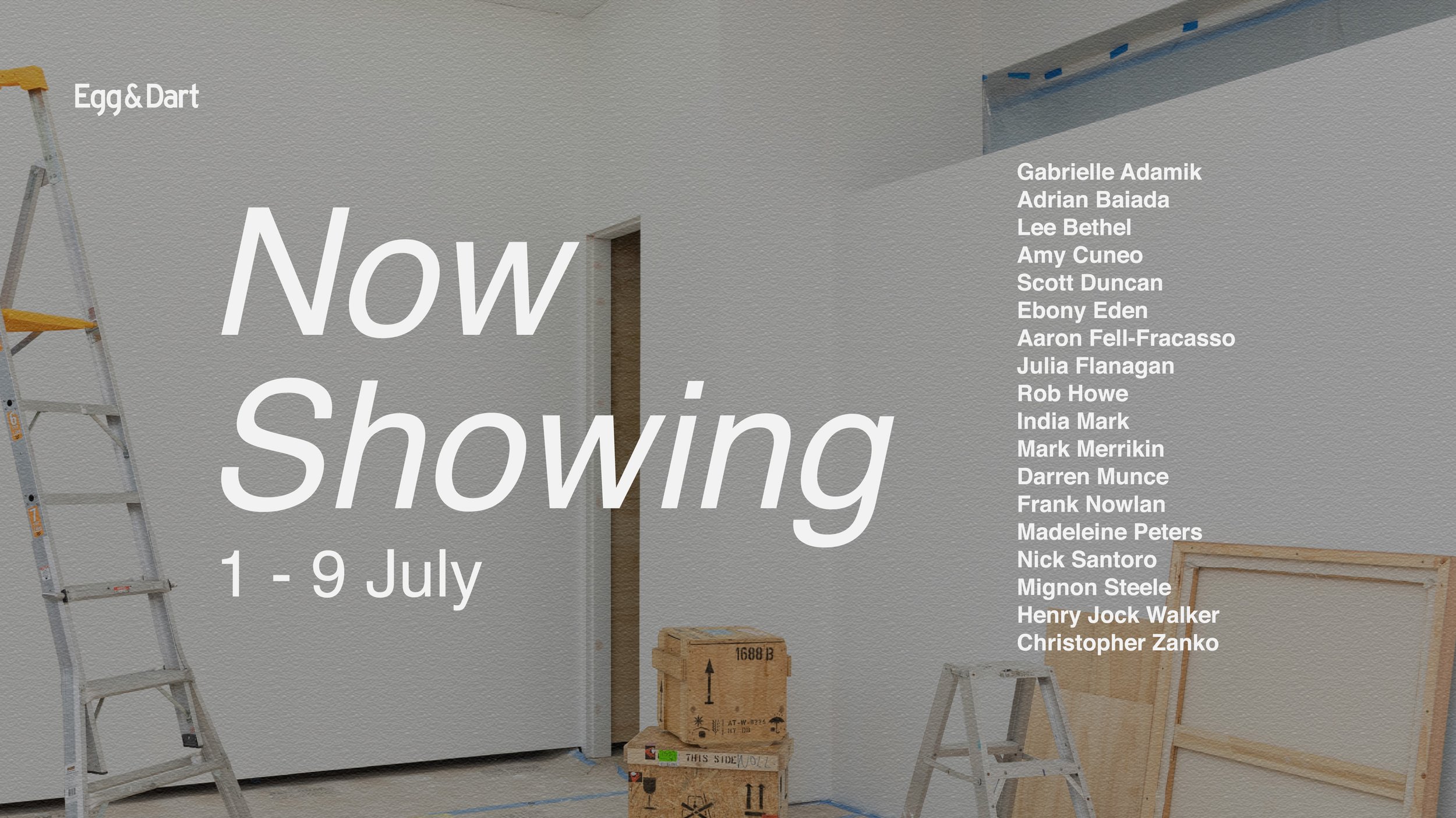
Now Showing
Join us this Friday 1 July, 6 - 8pm, for the opening of Now Showing. Featuring Gabrielle Adamik, Adrian Baiada, Lee Bethel, Amy Cuneo, Scott Duncan, Ebony Eden, Julia Flanagan, Aaron Fell-Fracasso, Rob Howe, India Mark, Mark Merrikin, Darren Munce, Frank Nowlan, Madeleine Peters, Nick Santoro, Mignon Steele, Henry Jock Walker, Christopher Zanko, Now Showing is the first exhibition at our new gallery.


Rob Howe
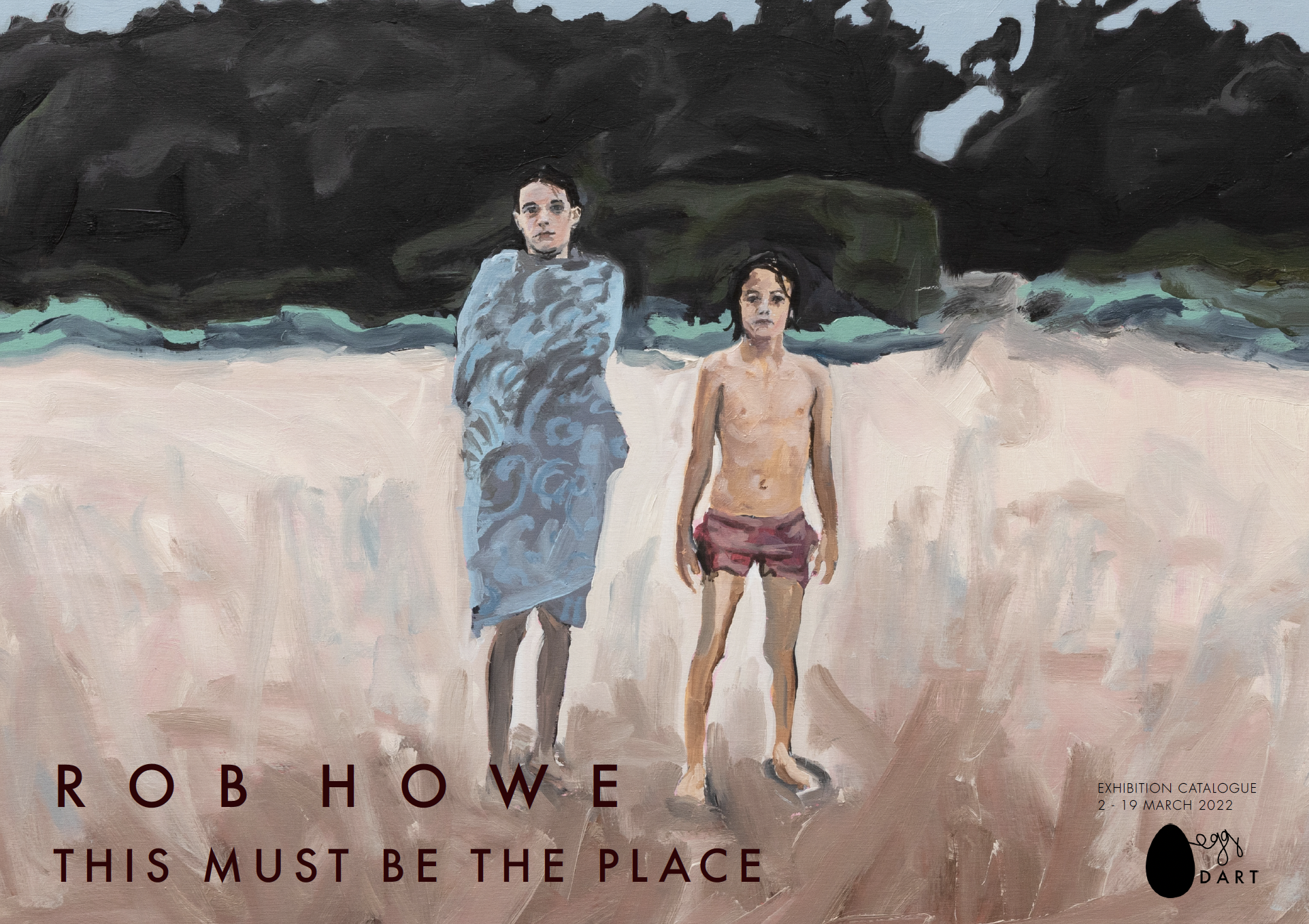
When I ask Rob Howe what he has been looking at I expect painters but he instead recommends poets and musicians. He describes his own paintings as romantic (like a pop song might be), pointing to the Talking Heads track referred to in the show title, This Must Be the Place. The new collection of paintings does echo some unexpected shifts in circumstance and domestic responsibility. Viewed as a collection, there is a sense of an artist re-defining what home is through uncertainty and inquiry, having moved with family to around ten different places over the time the works were made. Rob Howe says,
“(These) are sacred places that have been stolen and occupied. I often think about that as I work and play in it ... share the same place for a minute or two. I don't know all of what has gone on here, and as a white fella I'm often not exactly sure of my place. I need to listen more to find out. So, this is a modest attempt at listening by looking.”
A new colour language has emerged. From a base of phthalo and white there is a modulated, green-tinged blue that comprehends the brightness of the sky along the south coast. It also hits just right in the painted fibro of Turquoise House and is picked up in other works through clouds or the edge of a railing. This phthalo blue is most clearly employed in a glorious painting Corrimal Iron Bark, where it finds the high contrast of bursting foliage against a rough, contrasting trunk.
There are formal rhythms to find as well. The abstracted horizontal fade of roads and pathways brings poise to structures, offering a balance of clarity and evocation. Several works have a central element like a house, a significant tree or a figure, but they remain un‑staged in presentation, with tertiary elements noted incidentally. In the case of paintings with figures, like Front Balcony or Marion, Rob Howe sees the opportunity of a particular light and will then deliver a family member into the frame. It is the potential of the place that makes the moment rather than an organised portrait sitting.
“Home is where I want to be but I guess I'm already there..." Talking Heads begin their song with a line that suggests a journey taken in order to make a return. Rob Howe’s paintings document a fragmented journey that finds and then redefines a broader and now shifted sense of home and life.
-Melody Willis
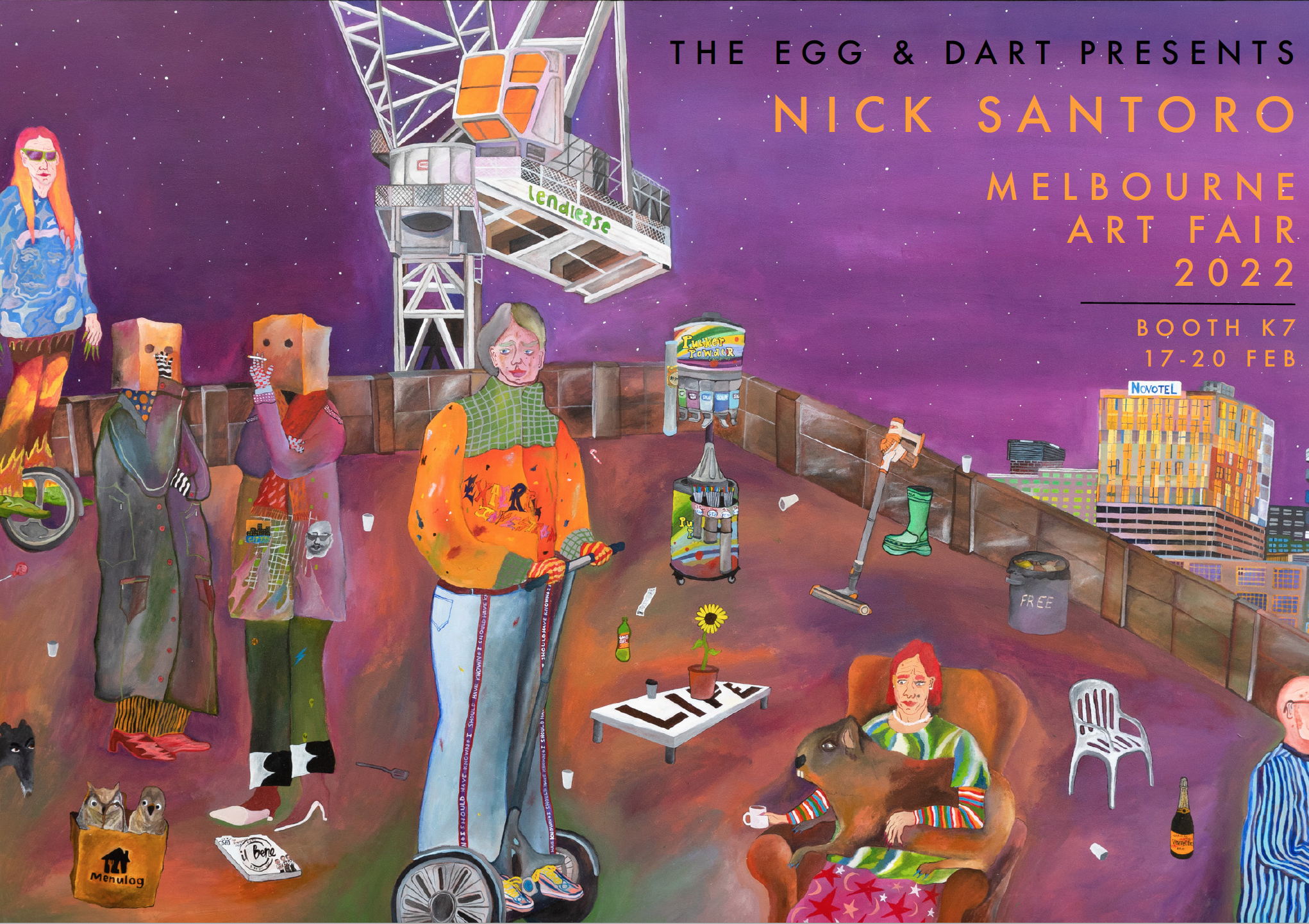
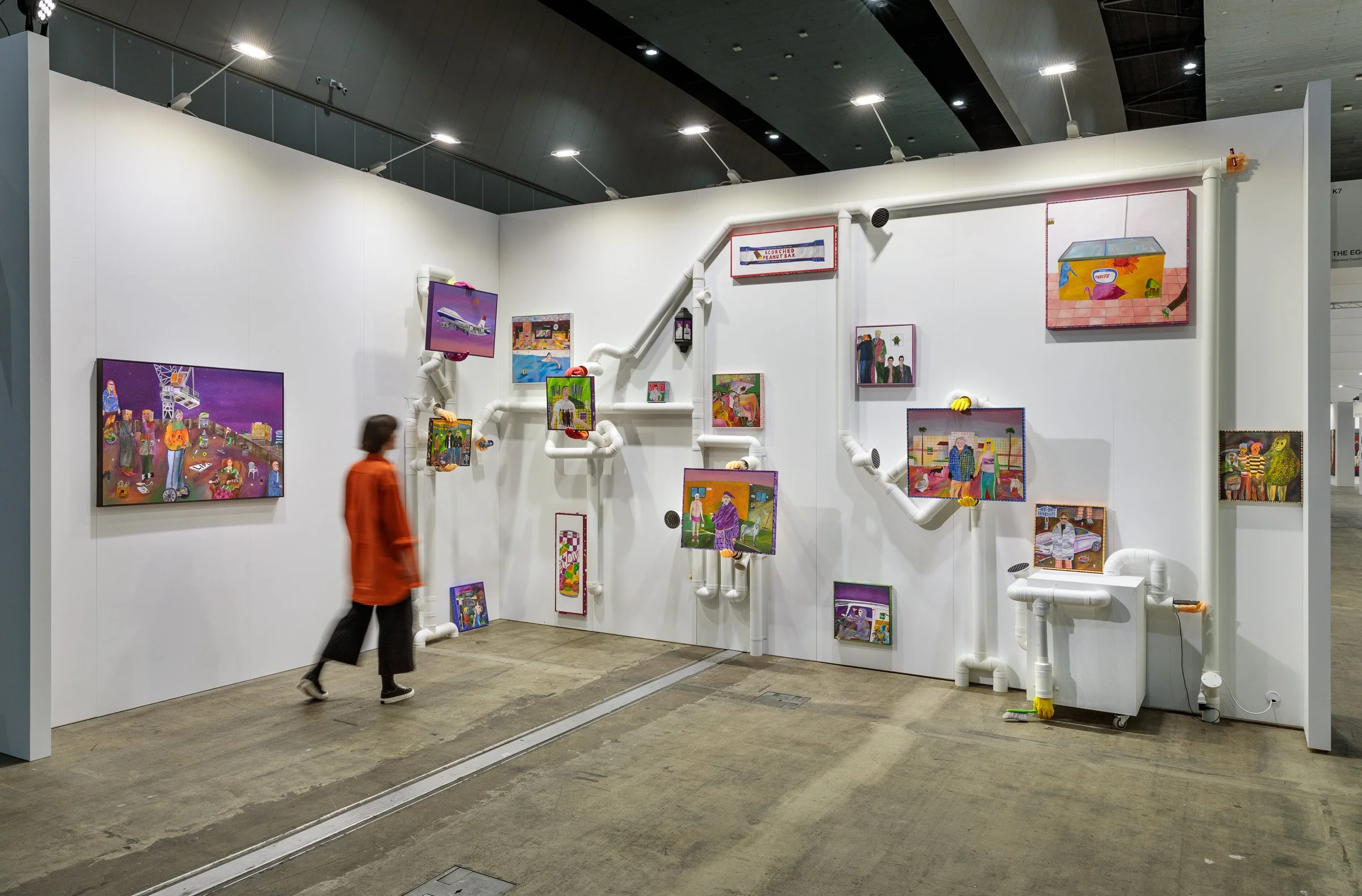
MELBOURNE ART FAIR 2022 | BOOTH K7
The Egg & Dart is excited to bring Nick Santoro to 2022 edition of Melbourne Art Fair. Find us at Booth K7.
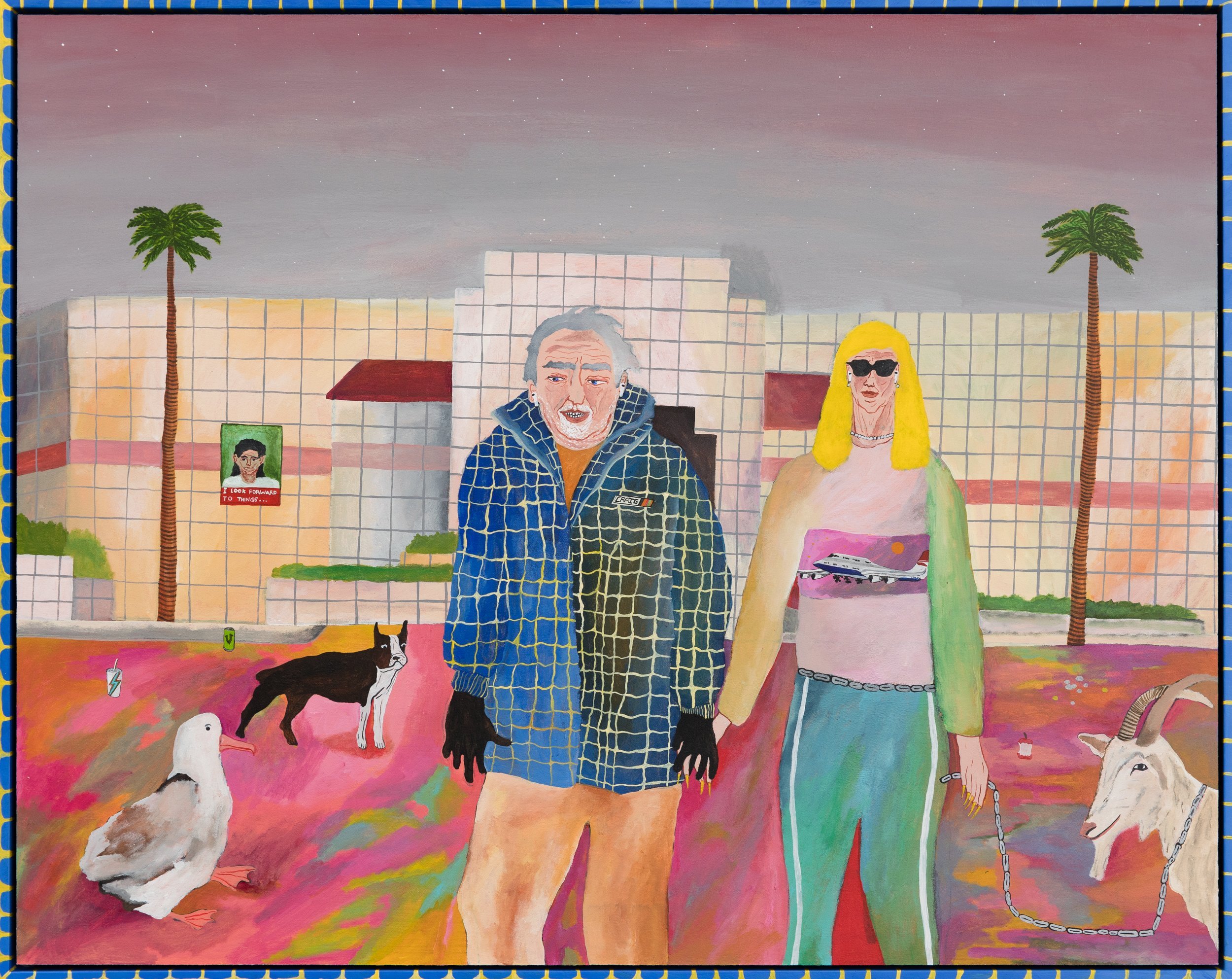
Nick Santoro’s work explores an ad hoc parallel between a tangled stream of mediated imagery and the shifting status of things on the street. His absurdist genre paintings offer a populated grab bag where outcasts and winners launch into speculative encounters in an atmospheric dimension between the local and the global. The approach is irreverent while giving symbolic weight to elements like a specific technology, a message on a T-shirt or a brand of shoe. Memory drawing, screenshots from his phone and an awareness of proto-Renaissance composition inform the work. Human figures and animals are elevated through outlines to acquire an aura of celebrity or transcendence. The ground plane lifts up like a stage while glowing skies offer an infinite backdrop.
The painted artist frames establish these paintings as objects that then extend out to include real structural elements like plumbing pipes, cyclone fencing and sculpted hands. The installation proposes a recombinant order to things by piecing together bits of piping as a make-do version of construction. In the other dimension, his drawings strip away colour to develop a richly textural, linear detail. While Santoro’s studio and digital archive offer a collage of reference points and diversions, there are no didactic politics to be found. The work is a data set of pop culture flung up to see what elements find orbit and what then falls back down to earth.
Nick Santoro was a finalist in the Archibald Prize in 2020 with his painting of fellow artist Phanos Proestos. The painting “Hewitts Avenue Montage” was exhibited in the John Sulman Prize in 2019 and his work was presented at Melbourne Art Fair 2020 and Sydney Contemporary in 2019. A significant installation formed part of Here + Now at the Wollongong Art Gallery near the end of 2018 and his work is held in the Wollongong Art Gallery collection. Nick Santoro was born in 1994 and lives in the Illawarra area.
Melody Willis
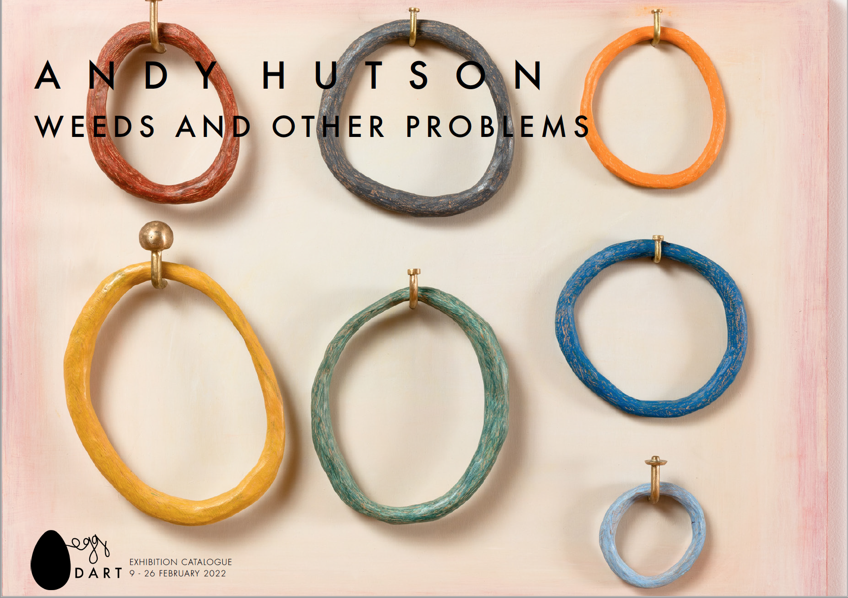
Andy Hutson
Weeds & Other Problems emerged from artist Andy Hutson riding his bike along a disused rail line in nipaluna / Hobart. He noticed the opportunistic growth of plants along the path and their attachment to disturbed soil in a remnant industrial setting. The flexible and opportunistic status of introduced species became a metaphor. Hutson explains that weeds “get in the way and shift the course from an original intent,” in parallel to the way an artwork can come together from an idea but with an unexpected outcome.
“Almost every time along the path there would be some other things that I would notice. It’s still that same process where I have this idea and all these distractions keep shifting my attention. I have a pocket notebook. What you end up with is something quite different from what was anticipated from the outset.”
The artist has a background in sculpture and jewellery making and completed a residency over 2020-2021 at Contemporary Art Tasmania. With an understanding of soldering and braising, this knowledge creeps into the pieces through the handmade brass attachments and the use of sanders and other tools to model the material. The works have pictorial elements, particularly in their connection to the variable qualities of the weeds encountered, their colours and forms. But in being almost-paintings they are also almost-objects, suggesting shelves, mirrors, hinged doors or framing devices. Each work reaches for a satisfying sense of containment and a structural integrity.
The sphere, the ring, ropes under tension and diamond shapes that suggest cyclone fencing – forms repeat and vary in size, scale and definition. The marine rope offers a further link to the specifics of place, namely the nipaluna / Hobart harbour. Fennel seeds are embedded in encaustic. Mallow flowers have been collected from the path, dried and pressed into the surface under wax, before being scraped back to a flat, resilient finish. In another work a bowl is cut and burnt with a heat gun to form a symbolic Oxeye daisy, a common weed in the district.
A Hole in the Fence uses plywood and found timbers including King Billy, an endemic Tasmanian conifer. The wood has been arranged as variable rings on handmade brass hooks and the work feels like an assortment of material origins brought together to propose a harmony. On the hooks hang loops of the various timbers, carved, painted and suspended like a collection of keys that describe negative space. Nosy Neighbour uses Huon Pine, King Billy and Tasmanian oak. Timbers are arranged as a cosmology of white spheres on a black surface. The specifics of material are important with pencil, wax and acrylic binders applied to both push and engage with specialised timber surfaces.
Andy Hutson is thinking about weedy problems and the complexity of states and materials. Plants are wonderful and advantageous but can be a problem in the wrong context. Then there is the problem of making art, of finding the right language. How should things hang or sit as an agglomeration? Hutson describes “trying to find ways to manifest an awareness of place and history associated with plants and land in general, in a practice that is pictorial and visual without being overt.” In his first exhibition at The Egg & Dart, Andy Hutson works with these tensions to find a contemplative and precarious balance.
Melody Willis


Scott Duncan | EMPTY VESSELS
In Scott Duncan’s ceramics, references from mid-century modern to antiquity fuse together through the firing process. Playful in construction and ambiguous in function, aesthetic histories adhere and then peel off like a turned up edge of corrugate cardboard. With a capacity to conjure the texture of an Italian Bitossi Ceramiche object or a local Bendigo Pottery vase, Scott Duncan pulls our focus to the echo of ancient forms in modern design. Antiquity stares back in the suggestion of an Etruscan face cut out of the side of a fruit box, the mouth inviting a hand to enter it. Duncan’s hand built forms might also suggest delicate perfume bottles with glass stoppers, while offering a scale that is as resilient as a Roman wine amphora.
On technique, Scott Duncan approaches things with a punk aesthetic. He has an idea of what he wants to achieve and then figures out how to make it work. Remarkably, each object is a single piece of earthenware. Shifts in texture, colour and gloss are achieved during the firing process. The artist makes his own dry underglazes, manufacturing chalk and his own pencils to create the idiosyncratic lines that mark the surface. Backing up the last five years of dedicated art making is his lengthy experience as a head chef. Downplaying the skill involved in ceramics, Duncan states, “It’s like making a cake,” before adding, “Porcelain clay is kind of like shortcrust pastry.” The production ethic and decisiveness of a chef is certainly evident in these pieces.
For the current show, Empty Vessels, Scott Duncan has ramped up the scale and constructed what he describes as a “mid-century monolith” of stacked forms. Saturn is a centrepiece of nostalgic modernist references looping back to a Greek myth origin story. Duncan’s Saturn ravenously expresses an enthusiastic appetite for the designed world high and low, from archaeological dig to a 1970s lounge room.
Scott Duncan grew up in Warrnambool on the south coast of Victoria at a time when the pathways offered for young men spanned football, farming or surfing. So he surfed and commenced art study locally with teacher Glenn Morgan. After recommencing his art practice, a residency at Kil.n.it Experimental Ceramics Studios in Glebe, Sydney, has connected him with an audience interested in ambitious work in clay. Empty Vessels is the artist’s first solo show at The Egg & Dart Gallery, Thirroul.
- Melody Willis


Darren Munce | DISCOORDINATED
Darren Munce offers up an ambiguous surface, the result of erasure, adjustment and slippage. Optical effects disintegrate with emergent geometries that scumble to grey. Skilled paint application is shifted through the squeegee scrape, an orbital sander or a rip of tape. With a background in signwriting and graphics, the artist can be very technical but this methodical work is upended through an impulsive counterplay. Works are rested and then returned to, carrying the weight of time. The paintings end substantially with accretions of oil along the edges, their corners softened by wear.
In one work, a seductive geometry of cubes sits atop a dense texture rendered through chance. In another, a deeply scoured surface is punctuated by a matrix of sharp linework that continues to respond to the undulations beneath. A lattice weaves over and under while carving new shapes and casting shadows. Loose grids and a range of greys mediate striking colour, making it feel right for rich magenta to sit with scarlet and deep cadmium yellow. Lines of lemon and zinc white pierce through as traces of a pattern language that has been pushed back.
An art residency in Leipzig (supported by the Australia Council and Creative Victoria) gave early context to Darren Munce’s interest in the divergent histories of abstraction. Geometry and chance, exactness and imprecision – his work demonstrates how these dualities find their real definition on the painted surface. By negotiating conflicting tendencies, he locates a zone where abstract invention can emerge.
- Melody Willis

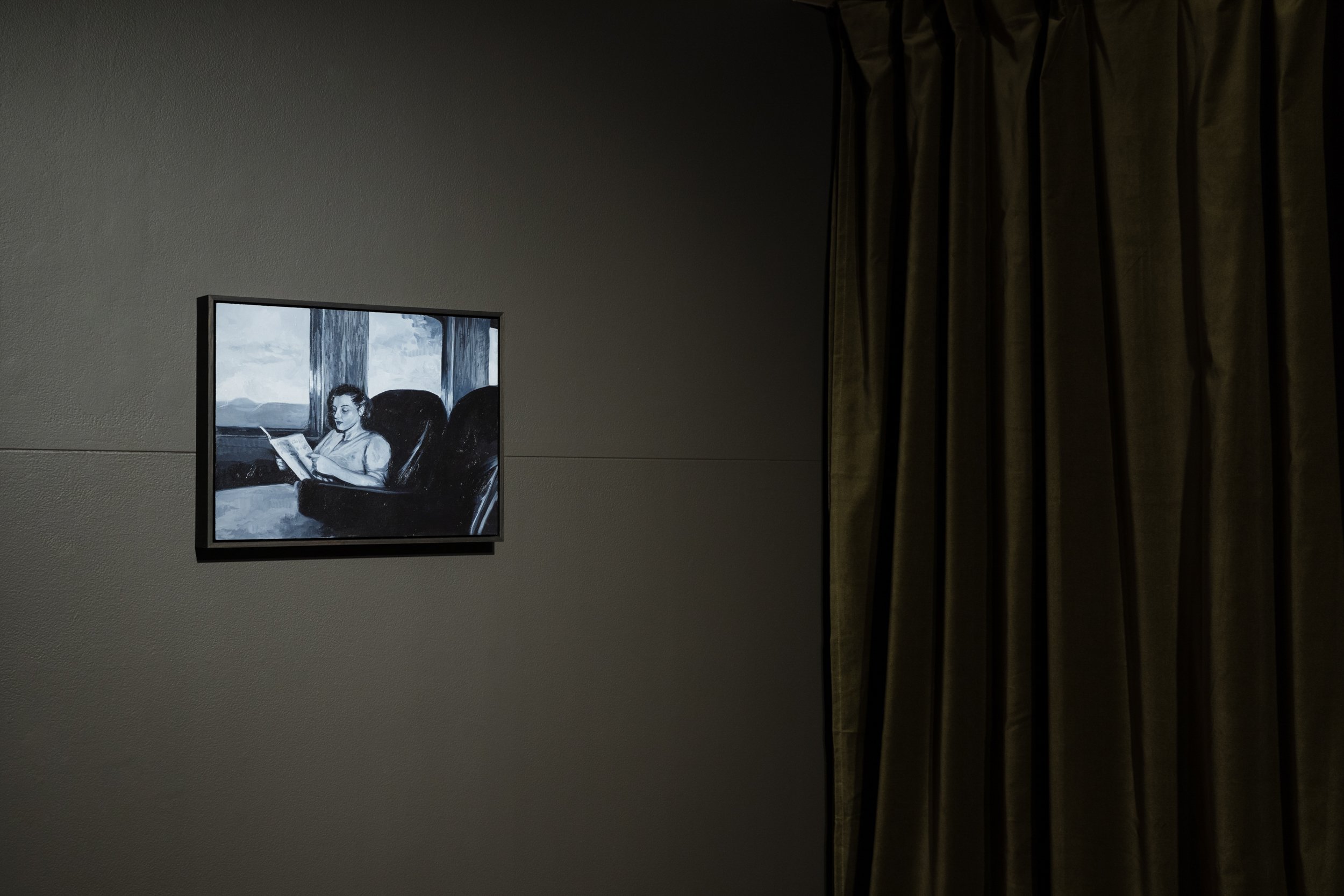
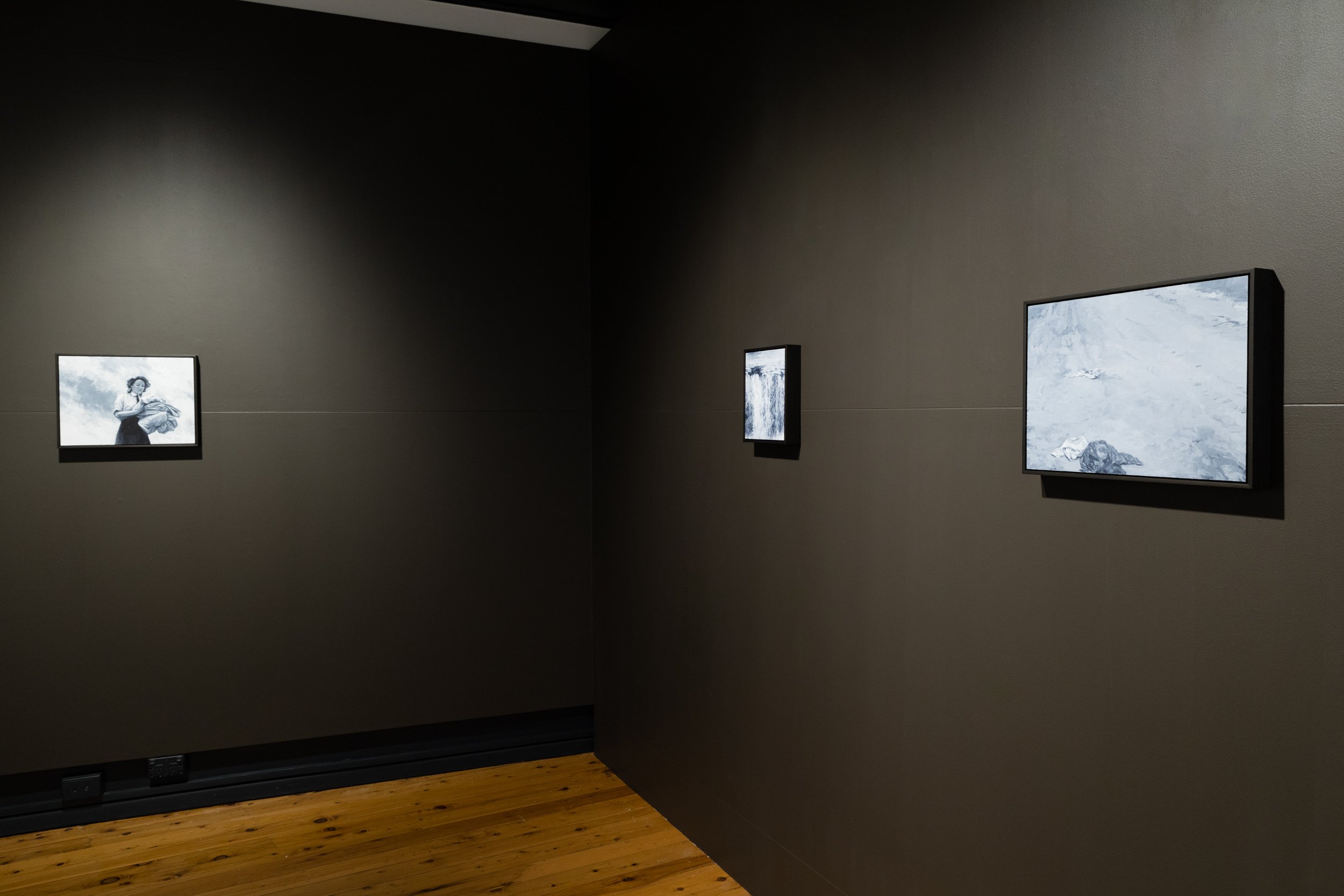
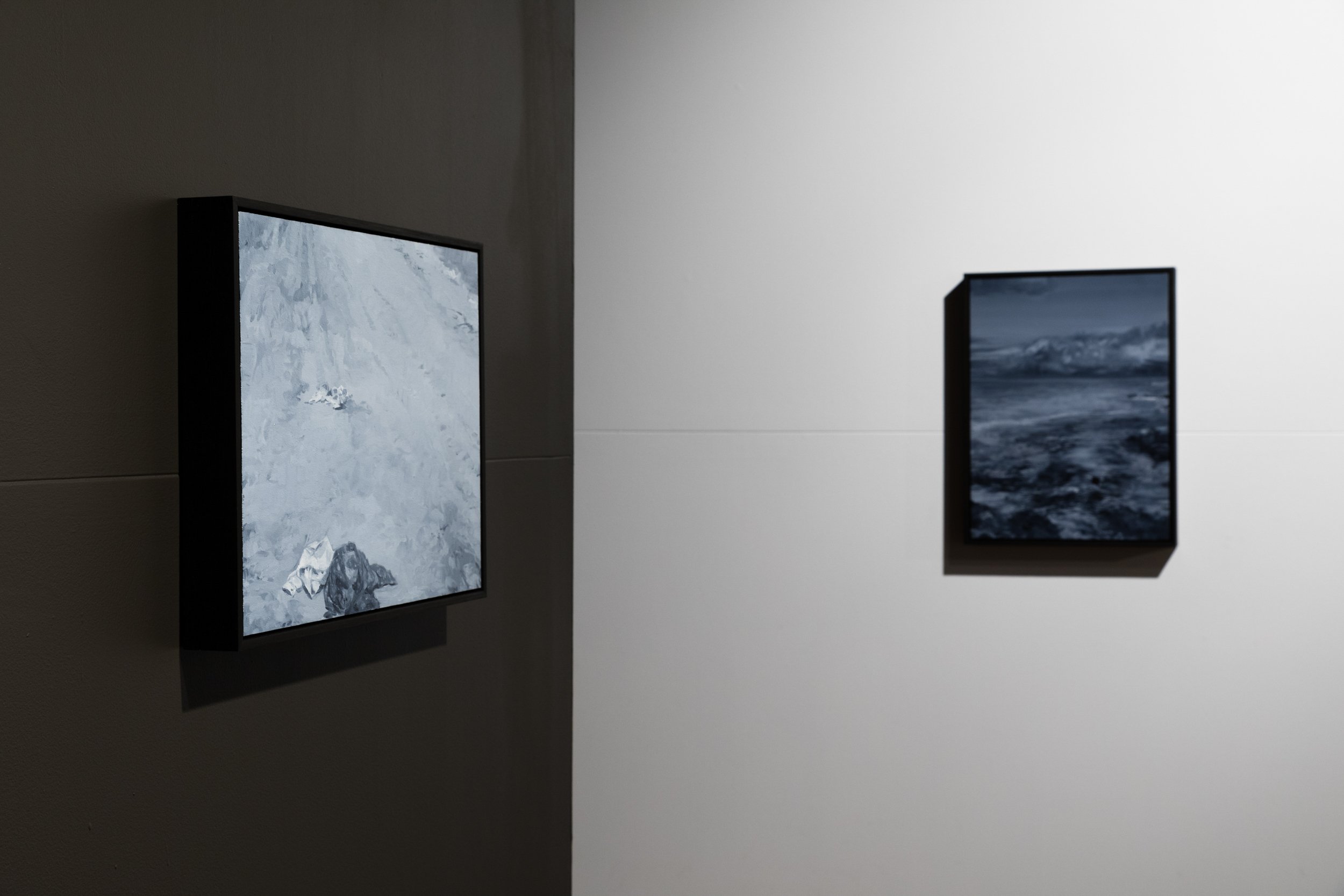
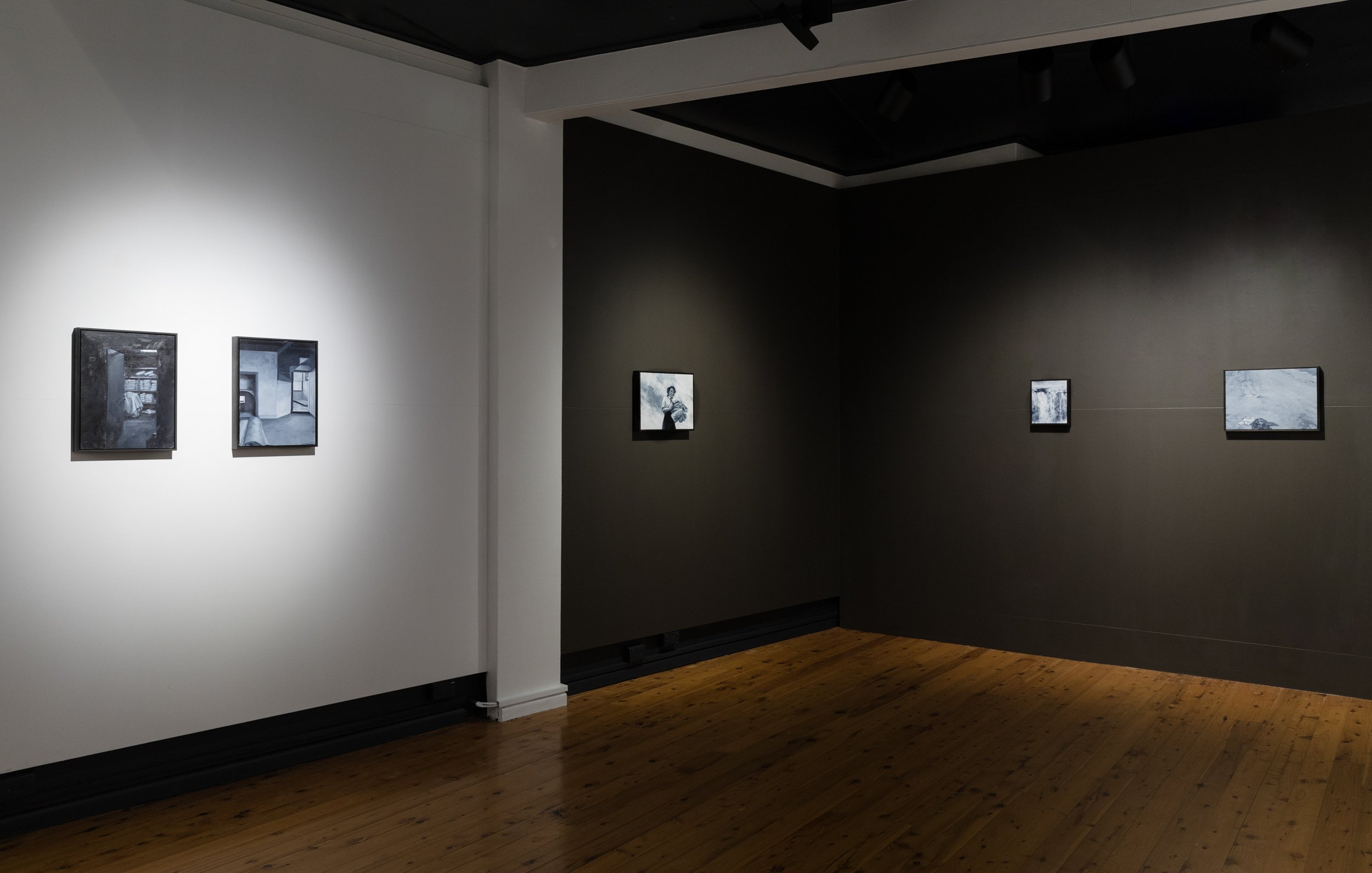
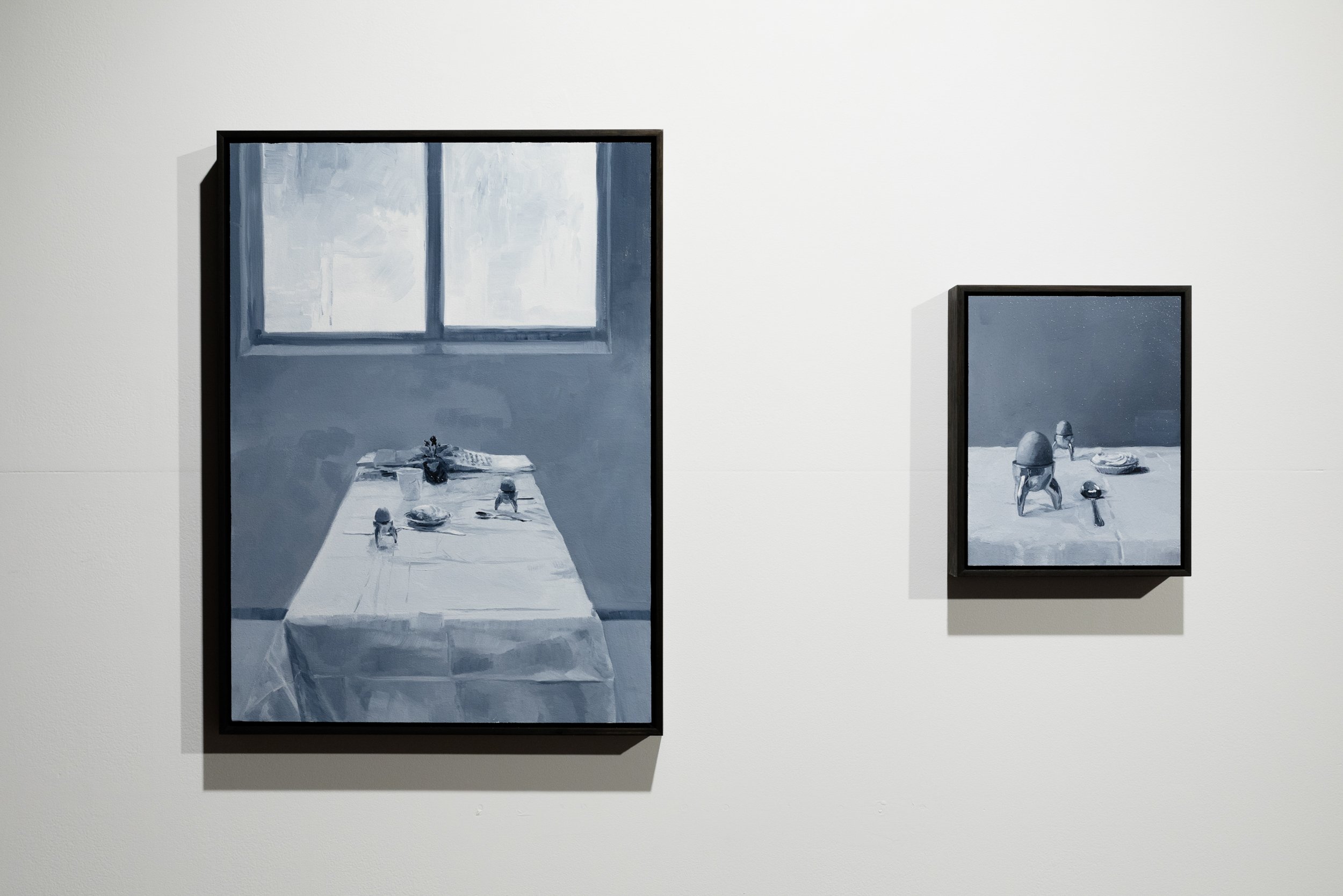
Madeleine Peters | NURSE OGILVIE'S BEDSHEETS
Madeleine Peters’ richly tonal oil paintings unlock fragmented narratives and expose time shifts, offering a sequence of compelling settings. In Nurse Ogilvie’s Bedsheets, Madeleine Peters makes visible female archetypes that are often sidelined – the working woman and the woman in a caring role. Through a practice of binding pictorial and verbal recollections, the images emerge as an instinctive response with an awareness of the limits of representation. She sees photo albums as serving as memory jolts, the images providing a touchstone for a more elaborate verbal recollection.
The artist speaks of “how people are held inside each other’s memories,” and in this instance she has gleaned tenderly from the life of her grandmother. The identity of Nurse Ogilvie is at the blurred edges of family memory, a woman working in a World War 2 field hospital and fondly remembered as “Fluffy” Ogilvie by the artist’s grandfather, a Royal Air Force Surgeon. With that entry point, the paintings move beyond any deliberate storytelling. The use of grey tone is a binding mechanism and the expression of fabric becomes metaphorical as it changes states – bedsheets gathered up against the sky, folded precisely or covering the breakfast table. When scattered on the beach the cloth responds to a jagged landscape and rolling clouds. The fold of the sheets signals the importance of detail, gesture and attention.
Madeleine Peters’ work acknowledges the gaps and false truths of any kind of image construction. Her paintings remain open for reading. We see a woman occupied in her carriage as the train pushes through the landscape, moving across territory, creating a non-place between motion and stasis. In another image, the boiled eggs offer a memory flash of an everyday breakfast, the mundane linked to the memorable – in this case, her grandmother’s recollection of the end of war.
Nurse Ogilvie’s Bedsheets offers historical context for a politics of care that has gained a new relevance. Madeleine Peters describes a practice of setting things right in her images and in this context, the bedsheets become a metaphor for a kind of psychological tidying. The alterations made in these paintings come with a kind of melancholic understanding that the past can never be reached. These are not portraits. The archetype moves in and out of visibility, at times a cipher, and then with such clarity as the memory of someone deeply loved.
- Melody Willis

Georgia Spain | ONE TO ANOTHER
The more paintings that I make, the more I remind myself that it is in the process and not the outcome that meaning is found. The gesture of doing it, over and over and over. That one can find meaning in anything if one looks for it. The same painting can be about breakfast, or the lack of rainfall in a year, or the state of politics depending on how you look at it.
- Georgia Spain

Georgia Spain | ONE TO ANOTHER (Copy)
The more paintings that I make, the more I remind myself that it is in the process and not the outcome that meaning is found. The gesture of doing it, over and over and over. That one can find meaning in anything if one looks for it. The same painting can be about breakfast, or the lack of rainfall in a year, or the state of politics depending on how you look at it.
- Georgia Spain

Julia Flanagan | LIKINGNESS
Likingness brings the warmth and joy of Julia Flanagan’s work back to the Egg and Dart Gallery. The past year marks a progression to a vibrant new palette along with an increased complexity in the abstract language of her painting and sculpture. Through shapeshifting and layering references emerge – perhaps to a machine or the head of a figure, a flower or a passing thought – before resolving in an open state of potential.
Julia Flanagan has been in a larger home studio since the end of 2020. With its warm natural light, this new context is evident in the shift to lemon yellows and rich orange. The intensity is then tempered by the complementary counterparts of navy blue and deep green. The daily environment has a real influence on Flanagan’s processes and the events of the past year have increased that crossover between family life and creative practice. Well loved music, play time or her children’s words find a way into the work. I dreamed I was having a dream but the dream was no dream, a quote from her son, is a note on this interlocking dynamic between domestic experience and the studio.
With paintings raised on a platform, Flanagan generally works close to the surface. As viewers at that proximity we can also see the detail, decision making and alterations that have occurred. There is a plan, generally a drawing, and then the plan needs adjustment. References to essential architectural forms remain but the arches now link up and soften like theatre drapes. Three new sculptures, with the addition of perfect spheres in bright colours, suggest assemblages as a mechanism or prop. The artist forms pieces using an electric scroll saw, with some shapes needing to be hand cut. She then refers to her own drawings as she glues, clamps and constructs.
The linework in these paintings is more intricate, fascinated and layered. An almost impossible level of compression takes place in the trajectory of these stripes and shapes, but it succeeds. Flanagan offers an embracing quality of positivity, further supported by the show title, Likingness – a rarely used word suggesting unabashedly pleasant associations between things, all while floating around the deeper challenges of making work.
Julia Flanagan exhibited as part of Sydney Contemporary in 2020 as well as collaborating with fashion label Gorman. In 2019 she won the Georges River Sculpture Prize with the piece Everything I Own. The show Likingness is Flanagan’s second solo exhibition at the Egg & Dart.
- Melody Willis


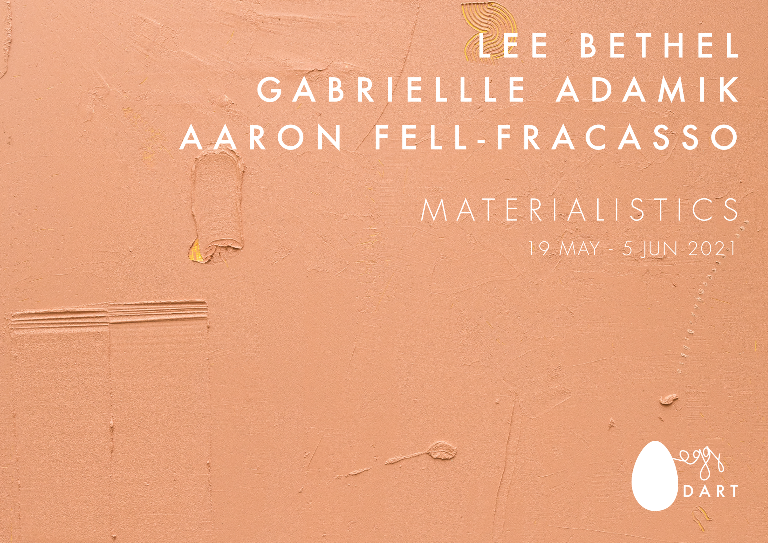
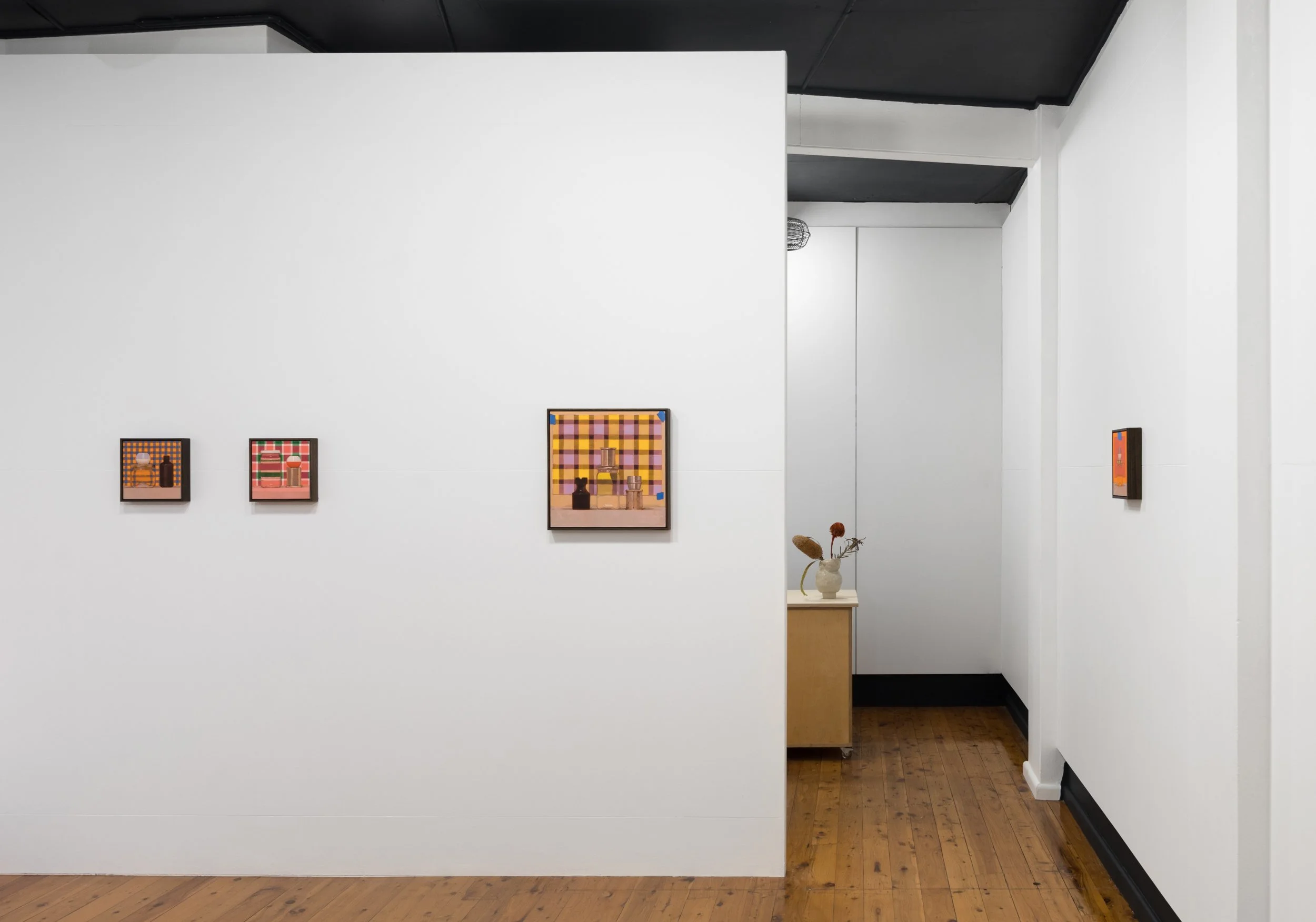
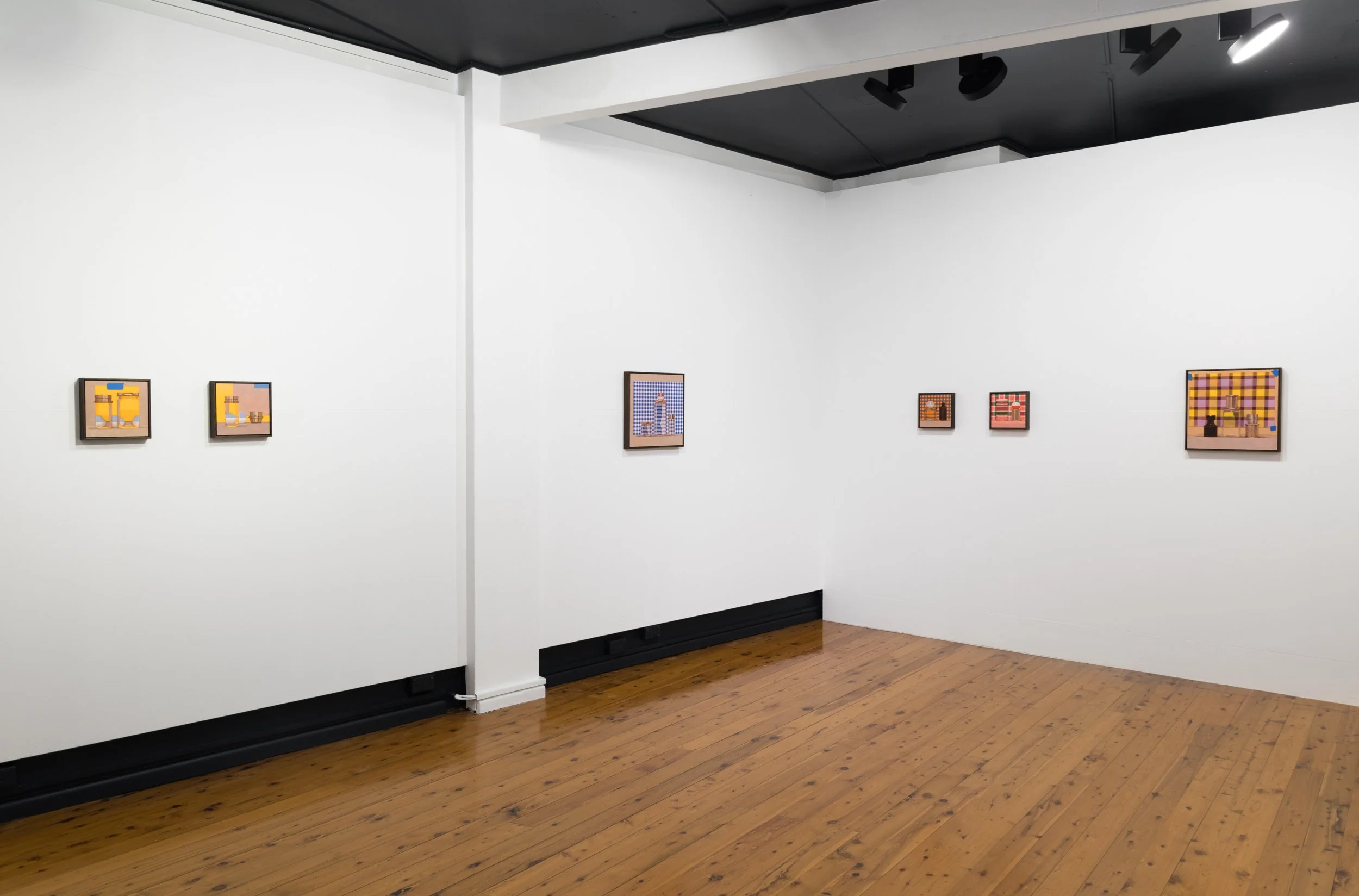
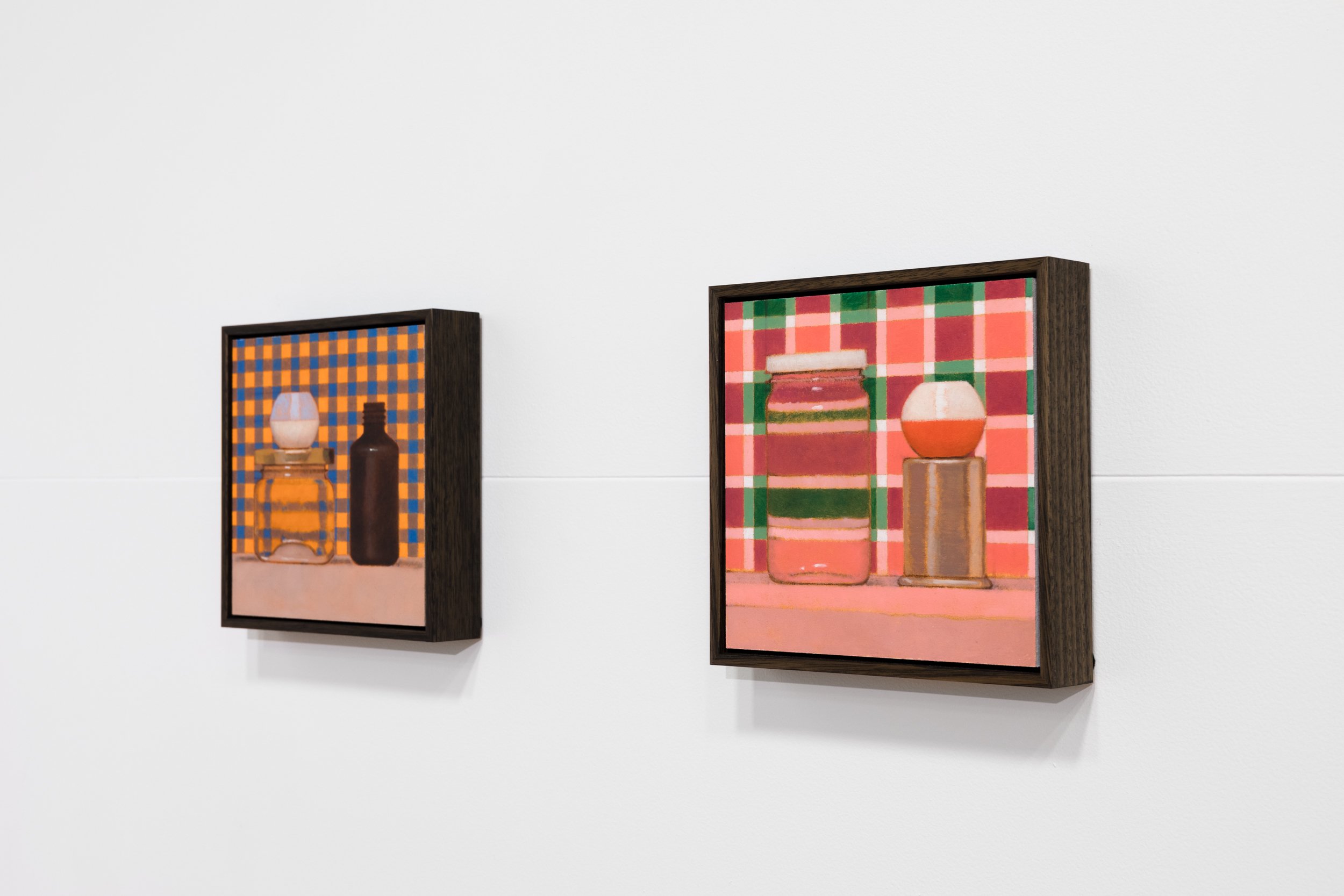
Gabrielle Adamik, Lee Bethel & Aaron Fell-Fracasso | MATERIALISTICS
In art theory, a trick of the eye is called trompe l’oeil and the purpose of this technique is to make the viewer believe they are seeing something when in fact, they are not. This visual effect is created through the mastery and manipulation of objects and materials, as well as the spaces they occupy. The key here, is the use of and experimentation with materials, rendered in ways that are not of the usual, a practice that unites artists Gabrielle Adamik, Lee Bethel and Aaron Fell-Fracasso. Materialistics is an exhibition that does not set out to trick the eye, but rather, to present familiar materials in unfamiliar ways.
In this exhibition, Gabrielle Adamik’s glass sculptures bring the unexpected to the forefront with their bold pairings of materials. These gestural works sit on the precipice of stability and fragility as smooth, glistening glass springs out of heavily flocked, recycled timber bases. Whilst the fine glass fronds reach out and interact with the space around them, the bases act as counterweights that anchor and steady the works. The outcome is an unexpected interaction of two processes and outcomes, with Adamik nudging her materials into delicate yet supportive arrangements.
An intimate relationship with material informs Lee Bethel’s practice and her resulting artworks are accounts of time, texture and dedication. This show presents Bethel’s works that have been made through the process of arranging hundreds of small pieces of hand ripped paper onto a backing board. The result is a vast landscape of contours through which the eye is invited to meander. Materialistics also gives the rare chance to see Lee Bethel’s sculptures which provide a continuation and development of the practice evident in her wall-mounted compositions.
Aaron Fell-Fracasso’s works offer the viewer a rich plane upon which are impressed a number of determined and purposeful landmarks. At first glance, there is a resulting uniformity to the artwork due to the use of a homogenous palette, however as the artwork allows the viewer time and space, an array of colours and textures emerge. By mixing sand with oil paint, Fell-Fracasso is able to sculpt the paint using tools both industrial and self-made. These sculpted ridges, smudges and scrapes have a familiar quality to them and infer, rather than make obvious the process by which they are made.
This is a group exhibition in which the focus is placed on the surface, texture and topography of an artwork. Materialistics is suggestive of a paring back to the essential elements of an artwork, to the careful selection and relationship between artist and medium, highlighting the way that material informs practice and vice versa.
- Eva Balog


India Mark | GOYA SODA
On a studio visit India Mark is wearing a soft green plaid skirt, a connection to the modulated grids that bring an innovative reading to her continuing still life project. In the new work, painted plaid interacts with harmoniously presented objects and stretches out behind lenses of water. The artist uses a digital program to generate her own patterns as a reference, but it is their transcription onto the surface through underpainting that radiates and enlivens these grids.
A key shift in this exhibition is a heightened intensity in the hues. Mark was challenged by the possibilities of colour through her discovery of posters by Redback Graphix, an Australian political print collective from the 1980s. On viewing these, her application of colour has increased in saturation while remaining closely attuned, demonstrating a real comprehension of light effects as she knocks back intense cerulean blue or cadmium orange with titanium white.
There are no initial personal attachments to the subjects India Mark paints. They are forms that promote deep observation through various light and textural effects. It is through time spent looking that the artist considers the vessels attain some value. “Now I am very attached to them.” In the studio, a number of items sit on a high shelf, more a collection of apothecary cannisters than her previous still life subjects of tea cup and saucer. “This is my favourite,” she says as she picks up a simple metal container before balancing it on top of a flat based egg cup. “I’ve got a thing about stacking.” Compiling the objects removes the function and brings the composition back to formal relationships. Picking up a small brown box, she notes that cubes are tricky. I wonder how this quite simple object might be a challenge but it is an indicator of the time Mark spends really looking and transcribing. Her paintings seek an exact measure through equilibrium and the ruled line, then softened by bevelled corners. Objects reverberate along their edges as they interpret an underlying structure.
Goya Soda is the name of the show and is also a song by French group Christine and The Queens. The two words contrast the intensity of Goya’s painting and the pop sparkle of soda water. The song is also about looking, with lyrics that state, “Who came there to see, who is seen.” India Mark’s new work aligns with both the pushing together of contrasts and the act of looping observation. In the studio she says, “What am I looking at? How do I break that down and paint it?” It is this demonstration of deep attentiveness which is of real appeal in India Mark’s ongoing project.
- Melody Willis


Nick Santoro, Scott Duncan & Henry Jock Walker | NICK, SCOTT & JOCK
Nick, Scott & Jock brings together the work of three artists exploring divergent materials through new approaches. Pen on paper, ceramics and abstract painting are well-traversed but Nick, Scott and Jock offer new takes on each, upturning conventions of form and technique.
The show is an opportunity to view Nick Santoro’s drawings separate from his paintings. These drawings have generally been initiated at a restaurant table or work desk rather than in the studio. Images are revisited and expanded on as an extended scrawl that brings Santoro’s universe of characters into black and white clarity. The landscape quality of his paintings fall away, replaced by densely textured psychological spaces inhabited by spectral pop entities and local identities.
This exhibition marks Scott Duncan’s debut at the Egg & Dart. With a broad approach to ceramics, these are composite objects of real technical complexity. Playful in construction and ambiguous in function, the works feel egalitarian and open-ended. Assemblage performs as collage and references from modernity and classicism fuse together through the firing process. Aesthetic histories adhere and then peel off. It’s an invitation to consider the iteration of these forms through time or to just enjoy the convergence of allusions.
Henry Jock Walker merges abstraction with unexpected materials. Collected used wetsuits are cut, arranged and stitched together to act as a memorial of time spent in the ocean. The detailed crafting of these works tests the rigid masculinity seen historically in both abstract painting and surf culture. With irreverence and mobility, Jock continues his overall challenge to expected representations in art, commerce and sport.
- Melody Willis


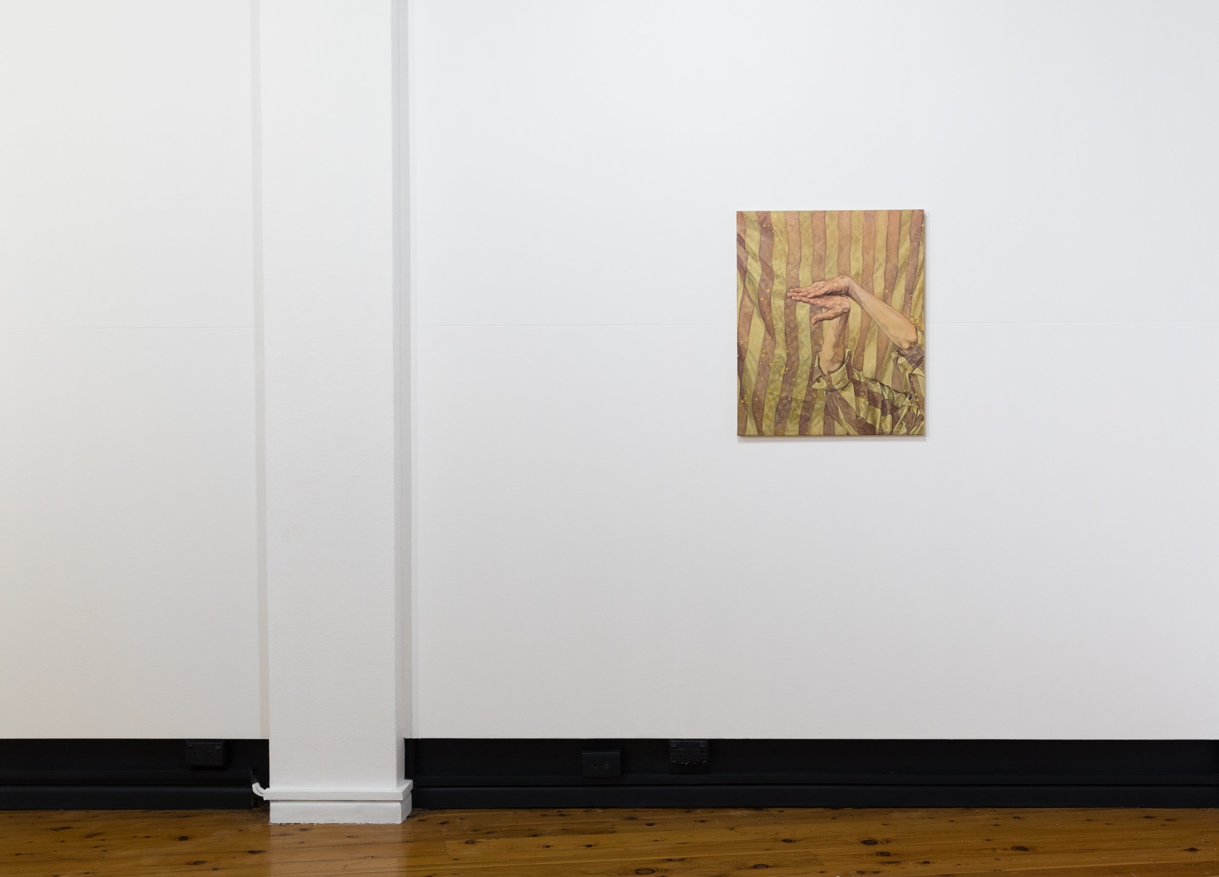
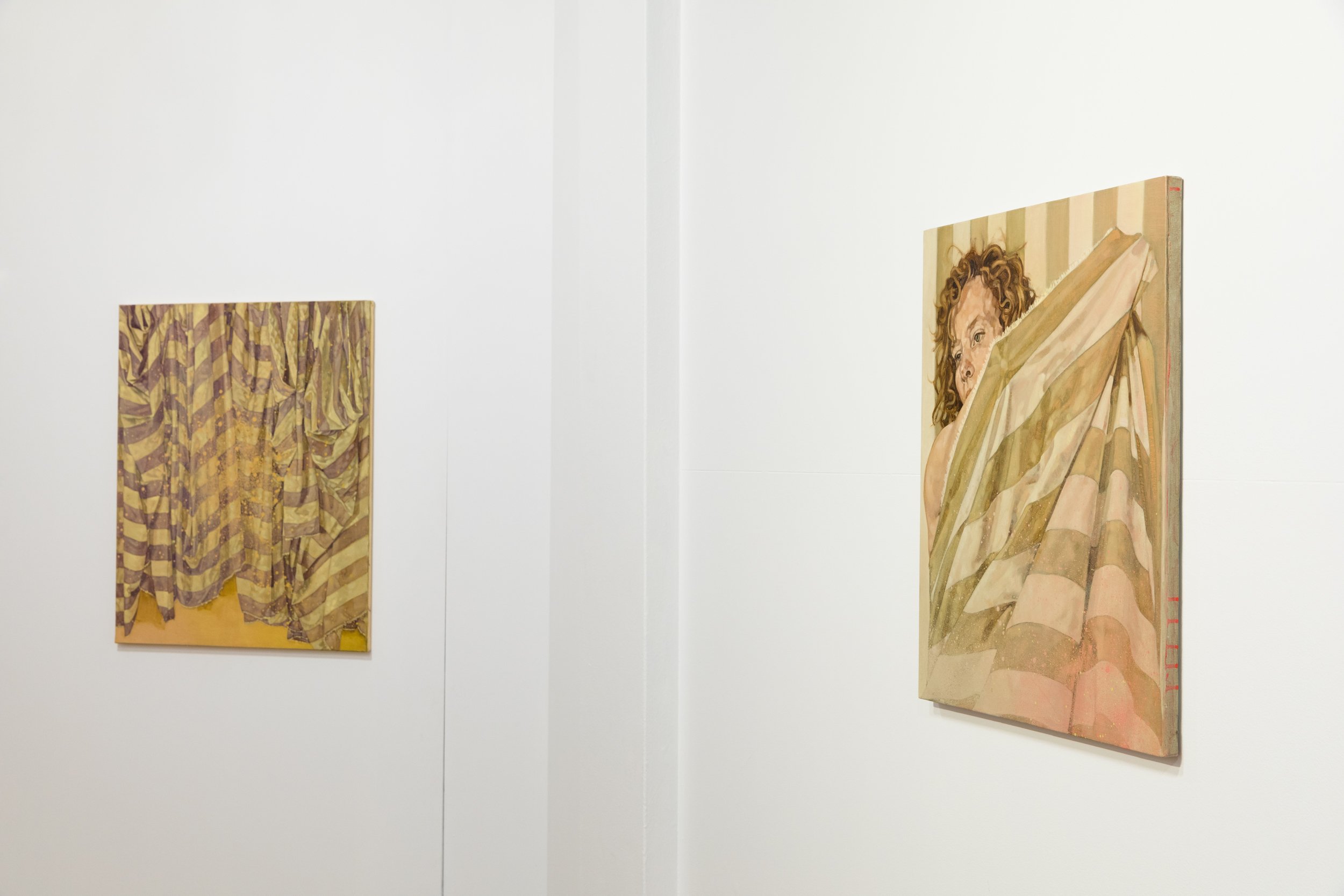
Clare Thackway | BETWEEN US
Clare Thackway shows us how figurative painting can unveil the relationship of intimacy to distance. The space between bodies is an ongoing consideration explored through the use of drapery and the stripe, with these ideas now palpable in the context of a global pandemic. The cloth creates separation and a physical barrier but this can also be felt as an act of collective care. There is a tenderness in the works as they unfold aspects of the body in vulnerable states. These are intimate paintings that contemplate our anxieties around contagion and a health response that seeks to separate and demarcate. The sensation is made visceral in the paint method through aerosols projecting across the surface. It appear as glitches, spots and sprays – masking fluid on the base layer generating areas of vivid pink and yellow that abstract the visual field. The breath, an essential expression of life, now requires containment and management.
The artist relocated to Paris from the Illawarra, and the colour has shifted to evoke this quite extreme distance. The paintings are interiors but eucalyptus green and gold hues cast a landscape quality over the work and there is a dryness to the palette that suggests Australian conditions. The softer lilac tones comprehend the more subtle light found in the sky at dusk. The muted approach to this light then brings us into the northern hemisphere.
The fabric stripe is a fundamental pattern used by Thackway for both contemplation and compositional strategy. The thick bands fragment and distort the figure by introducing a false contour that twists to create illusion. The shifts in surface play a trick with perspective – are the bodies standing or in repose? Are we looking down or across? Is there a body there at all? Culturally the stripe also has fascinating evocations – for hazard or hygiene, freedom and confinement. The artist works with these fluid associations as a personal trope that allows her to explore psychological states and social dynamics.
Clare Thackway works with subjects she knows well and although these are not portraits there is an intense feeling of intimacy in the work. This is countered by the drape of fabric and painterly surface interruptions that acknowledge the spaces between us. Previously the cloth was employed by the artist to explore connection, but in this current time we may feel the masking of the body as a deliberate separation. The newly pictured intermediary space, no longer a void, contains splatters of paint – aerosols with anxious potential. The spots that float in the foreground suggest an invisible interrupting force. In this context the works make contact with the interdependence of our bodies, intricately linked while separated by borders and systems of control.
-Melody Willis


Mark Merrikin | WITH FARIES
With an instinctive meshing together of material and feel, Mark Merrikin’s paintings capture everyday connections between friends and family. This might feel like a well-trod path, but there is an unusual tenderness and direct gesture in the work. Figures feel lovingly embraced by a wild meshing of patterns and shifting surfaces. A colour link to the Fauvist modernists is there but then knocked back by accretions of cement and spray paint. Built up grainy areas bring the outside in to these images, landing the work in an urban present.
Merrikin uses direct methods to get started. Sketches are made from personal photographs and remembered conversations. An old-style overhead projector helps to get the drawings up onto the surface. This is where changes take place, swapping up images, adding and overlaying the composition while moving across the surface with paint and pencil and spray paint.
In parallel with the paintings, the artist presents casual sculptural objects in the same materials, incidental in their presentation but resilient in their physical weight. In these tender and confessional sculptures, portrait and dialogue find a foothold in what feels like a broken off piece of pavement. The objects further compress the space between urban exterior and the homestyle intimacy of the paintings. Merrikin works in an instinctive and direct way, with an intent to fold us in on moments of personal exchange.
Mark Merrikin is an emerging artist from Woolgoolga on the NSW mid-north coast. He is now based in Port Kembla, having graduated from the University of Wollongong. The Egg & Dart is excited to present the artist’s first show at the gallery.
- Melody Willis